NATIONAL GALLERY OF AUSTRALIA
A bold and brave identity for Australia’s National institution
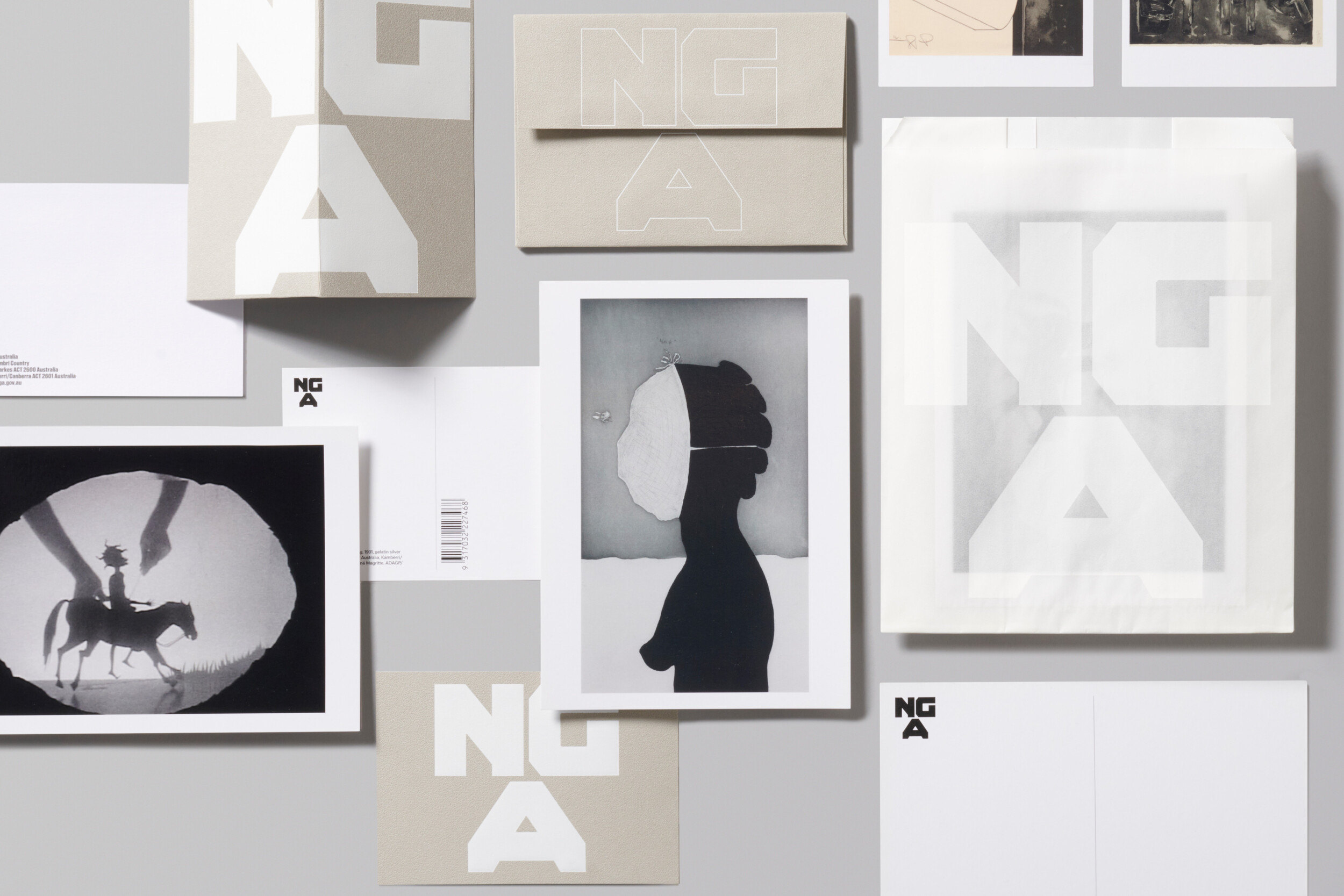
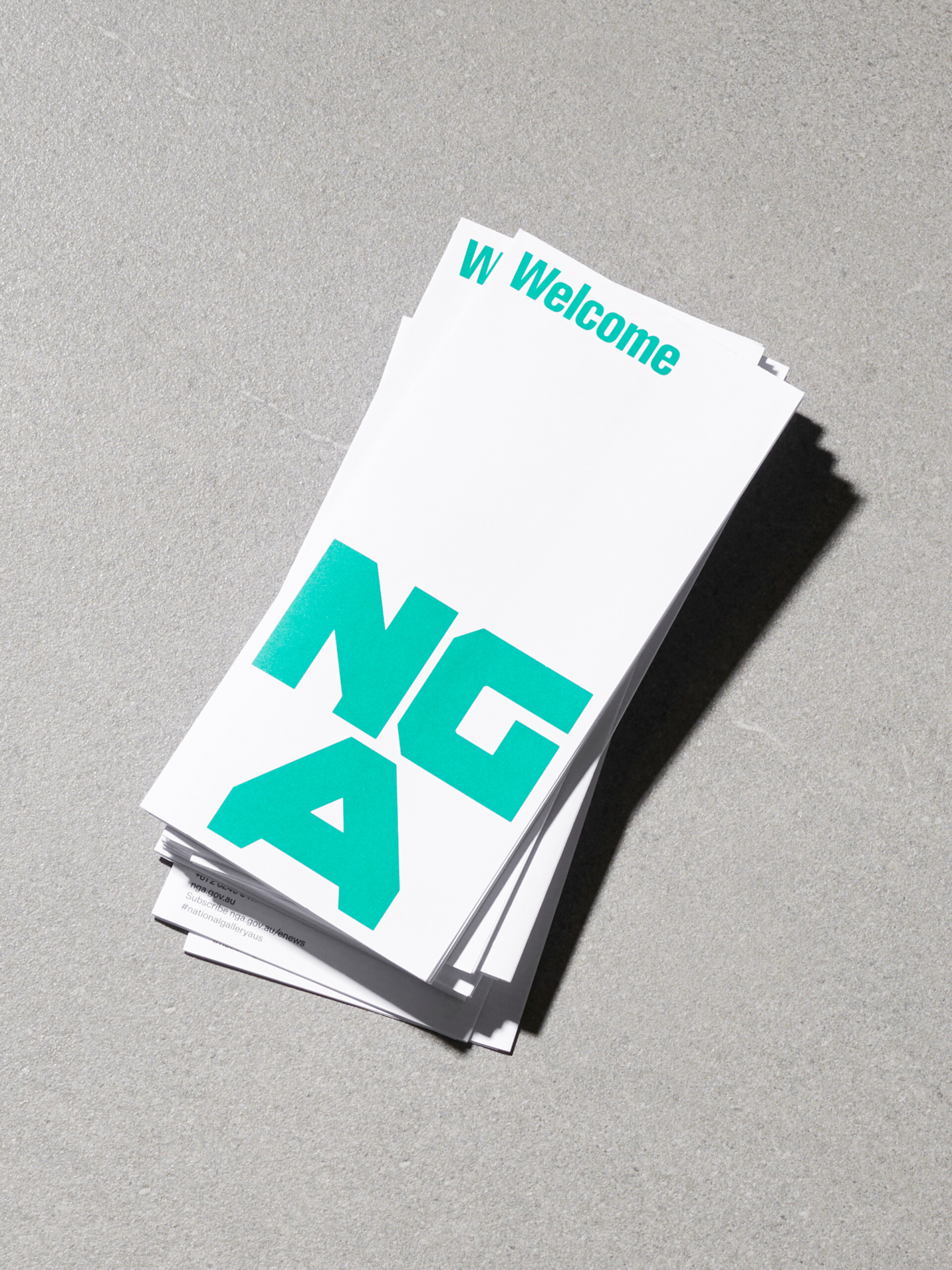
(EN) Positioning the National Gallery as the centrepoint for art in Australia, the mark reflects the trihex motif of the distinctive brutalist physical identity.

(EN) ‘Brut’, the National Gallery typeface was created in collaboration with Vincent Chan to articulate the voice of the brand, forming an expressive foundational element across all touchpoints.

(EN) The website is a platform to amplify the program and content of the gallery, creating space for multiple voices. It provides a hub for editorial and on demand media, a rich resource for engagement.
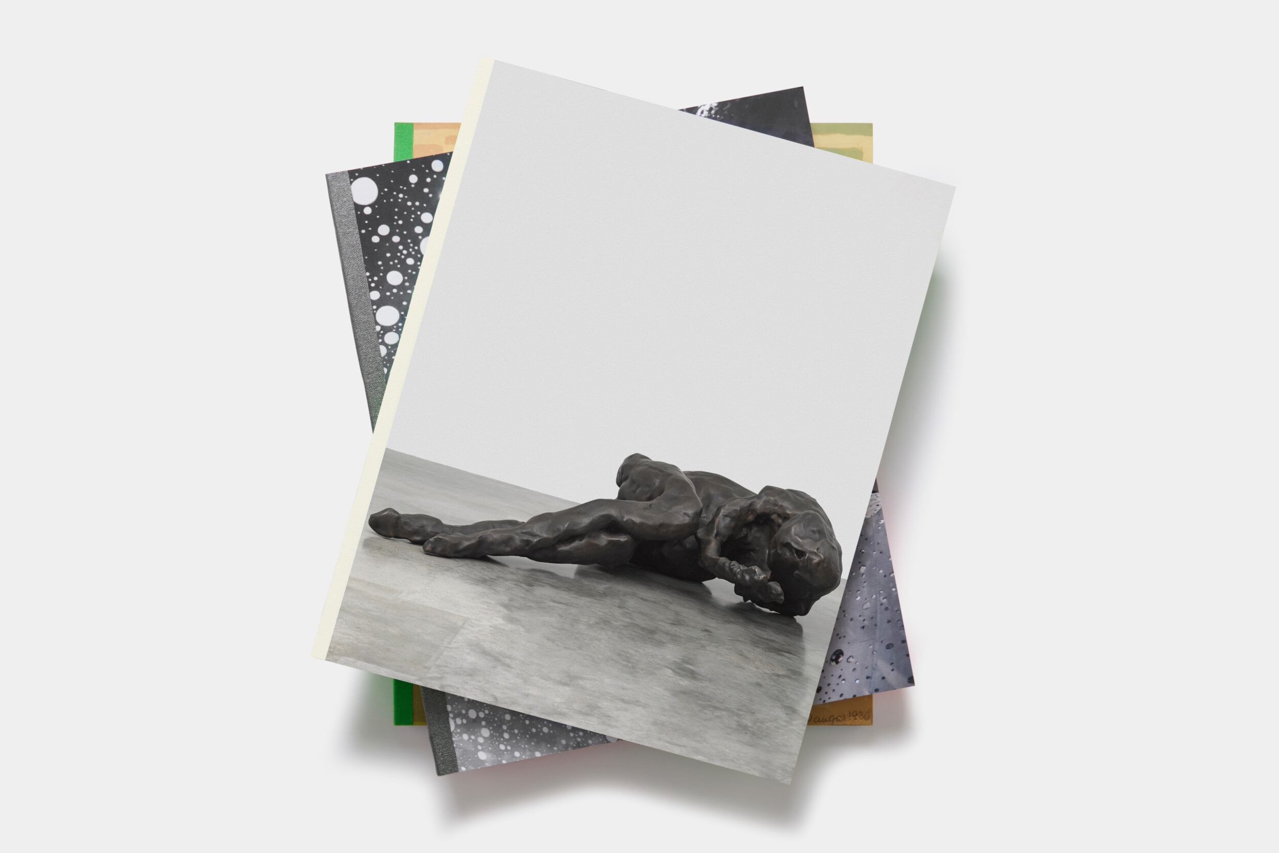
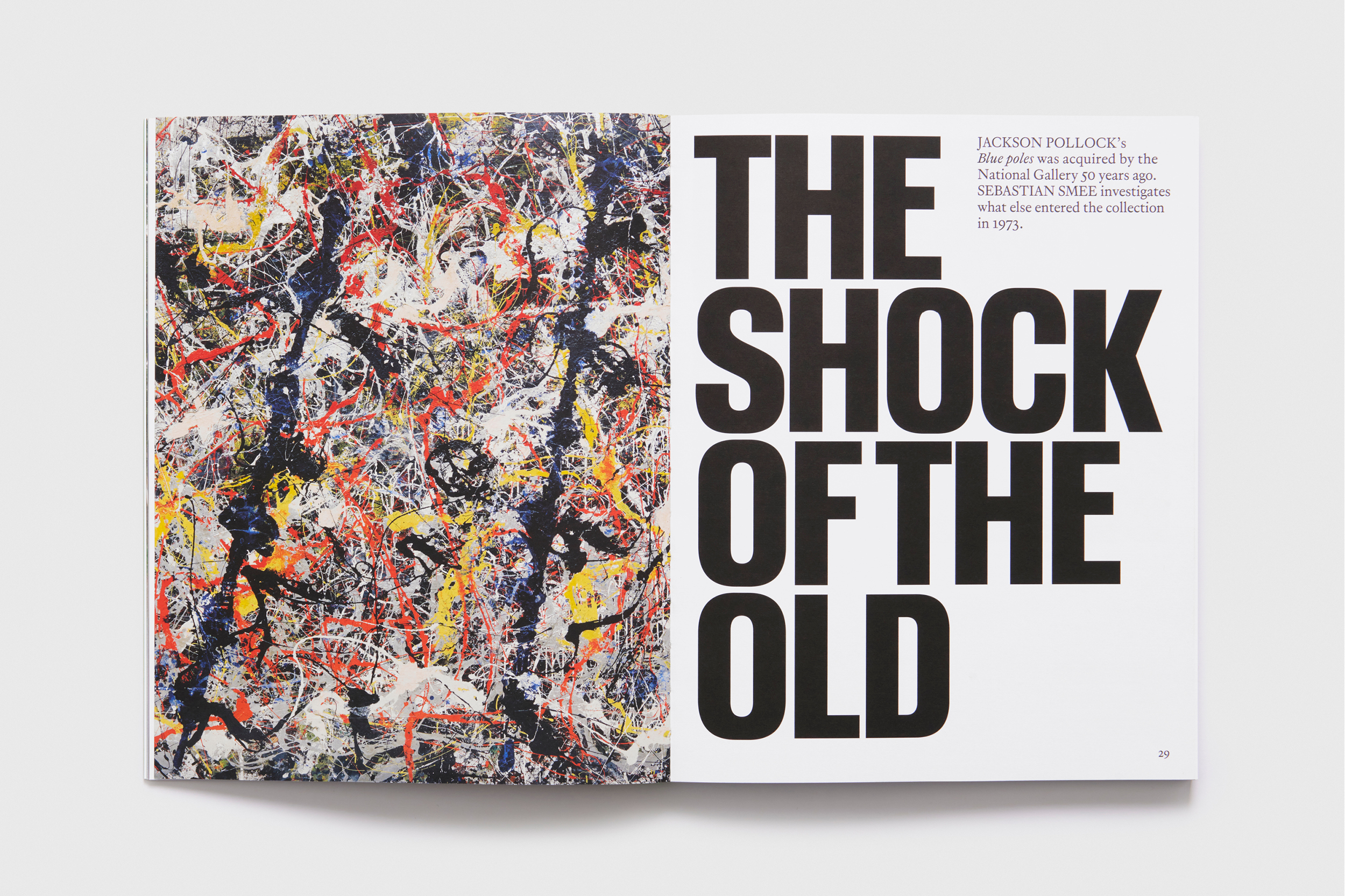
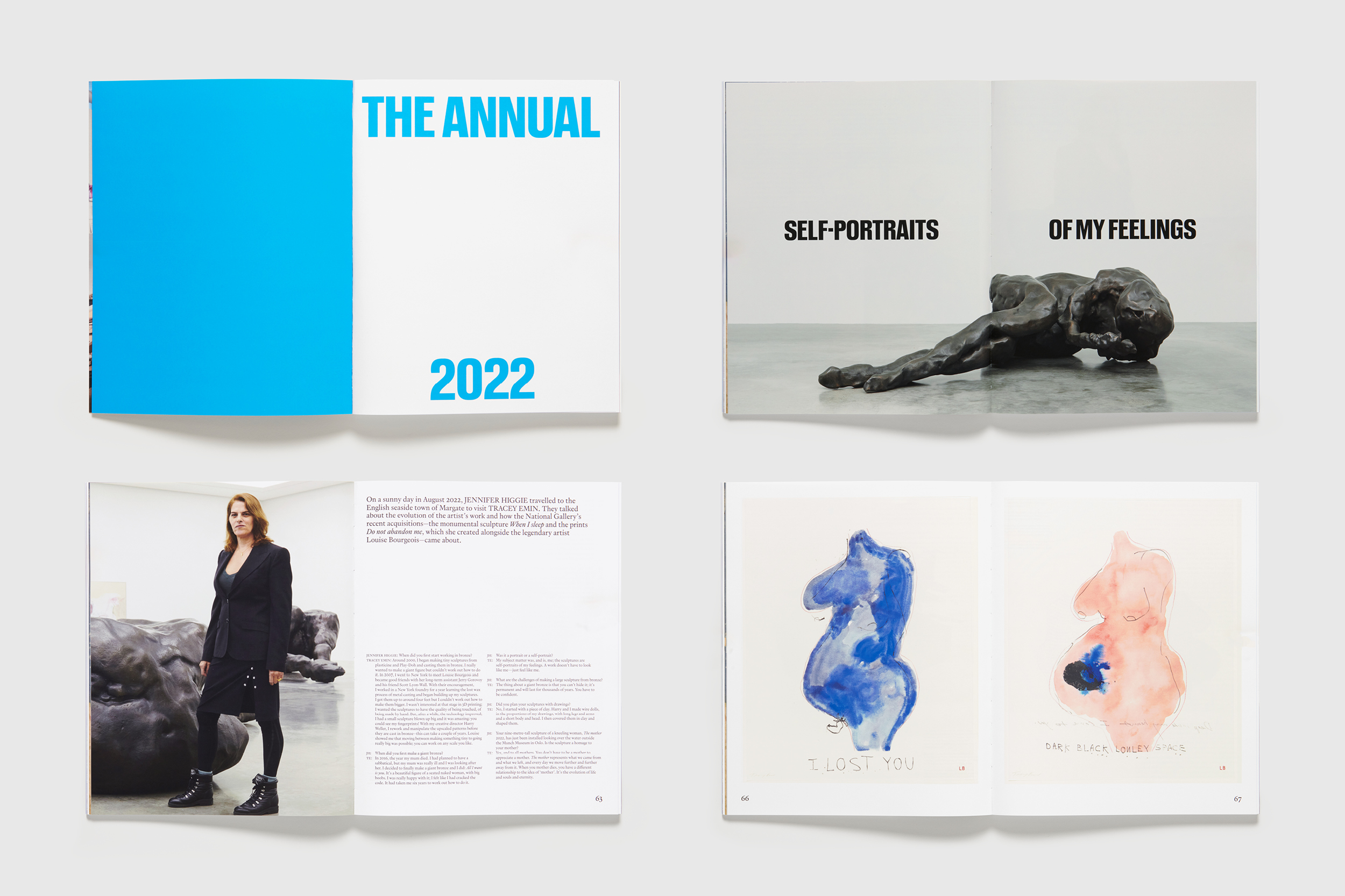
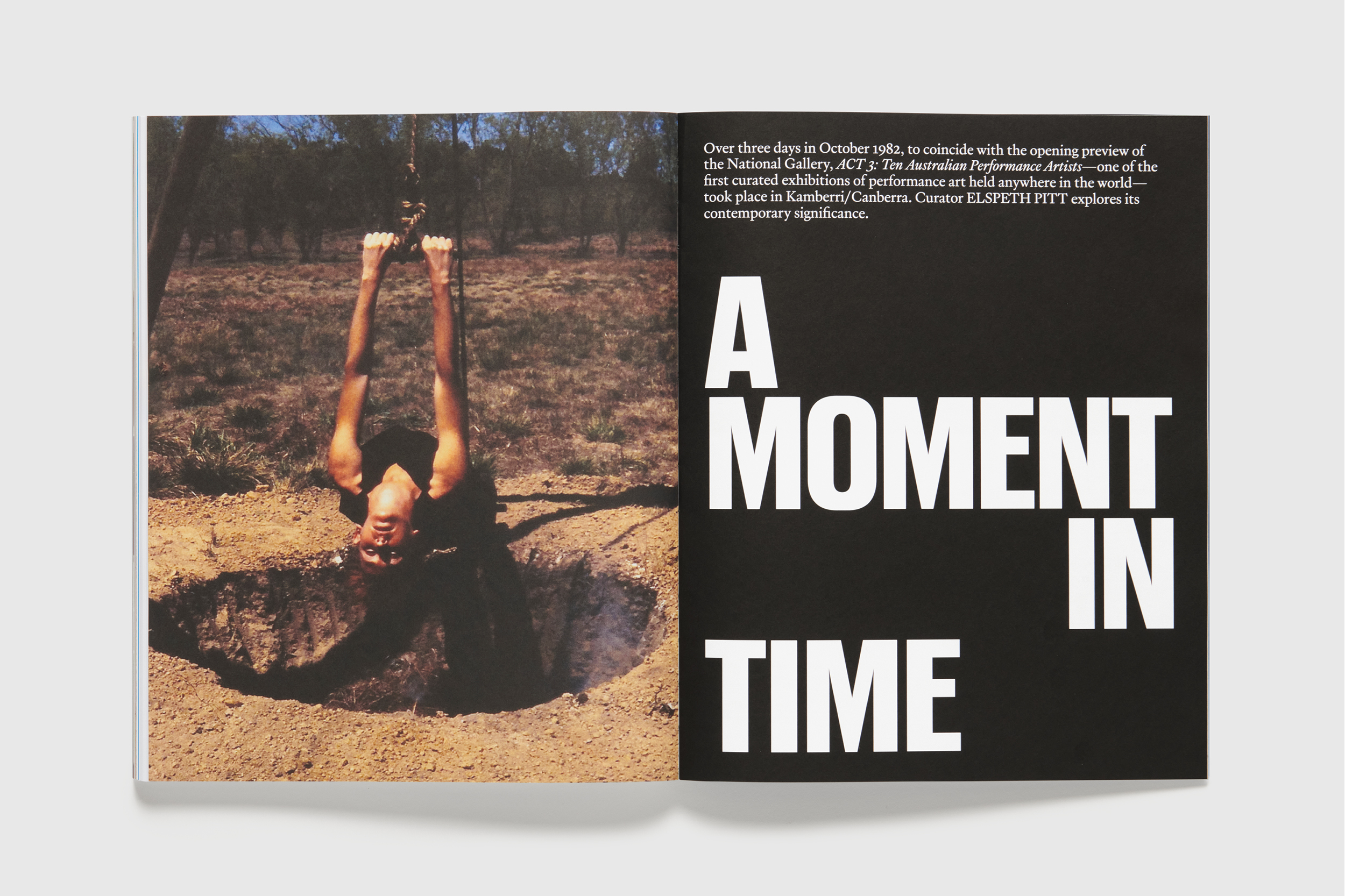
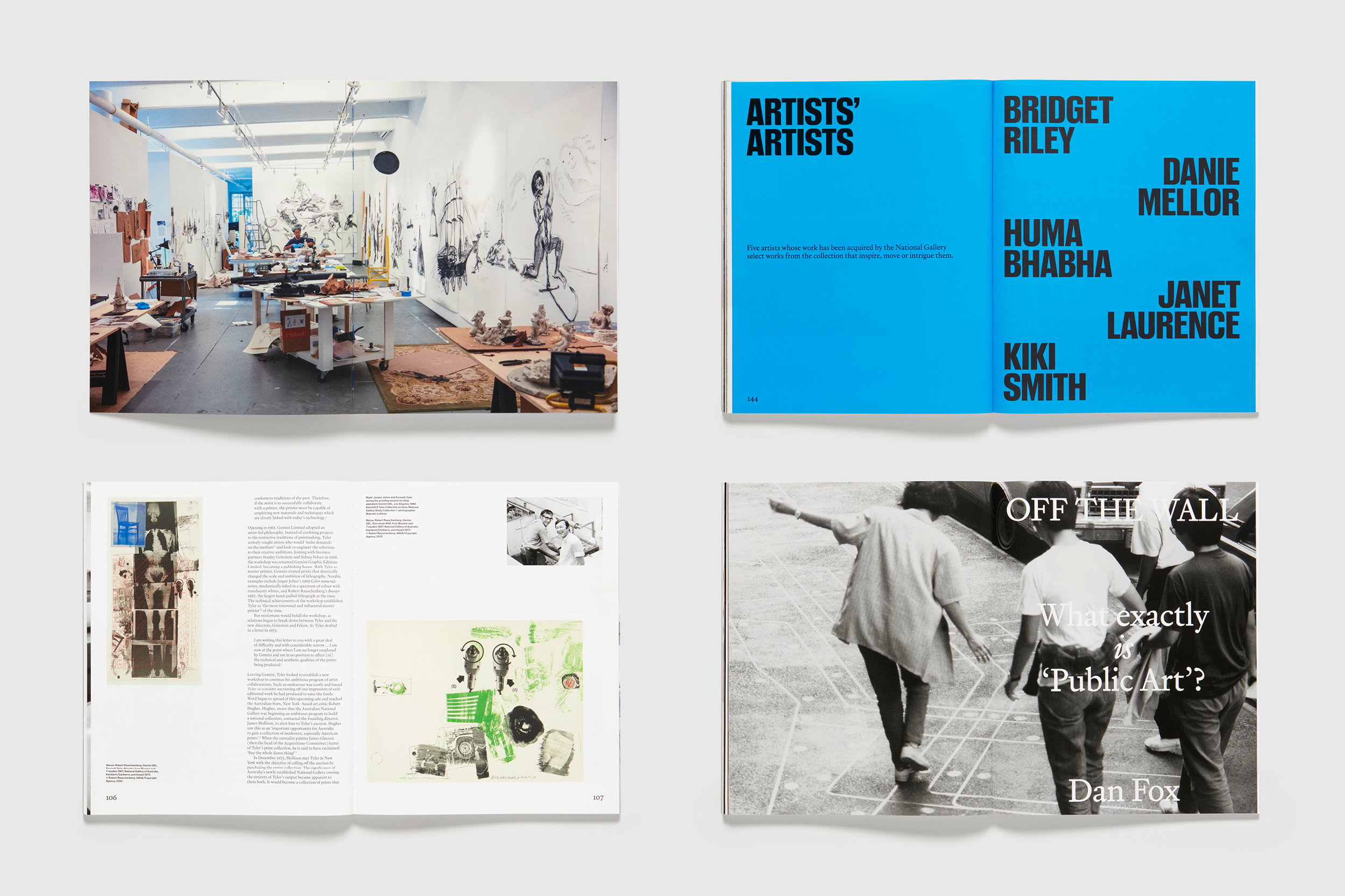
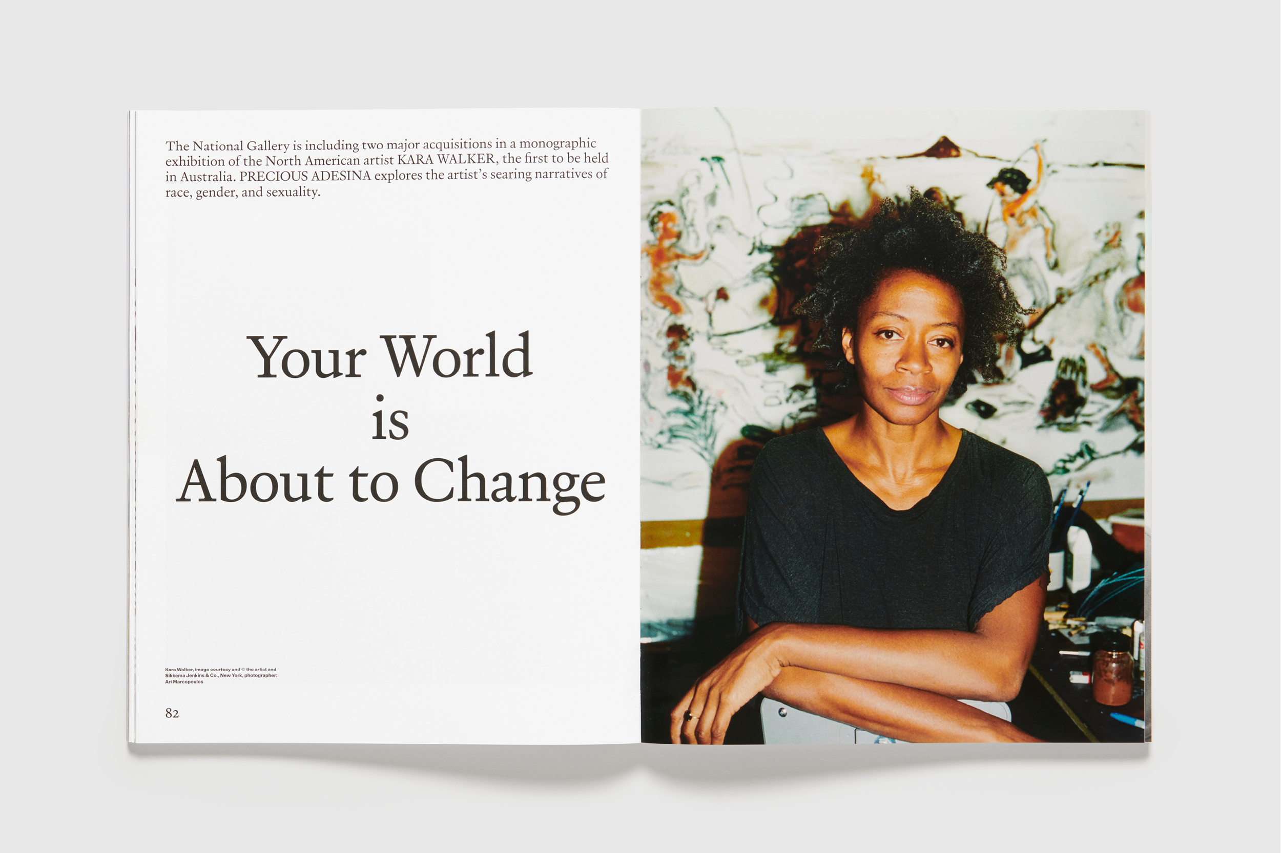
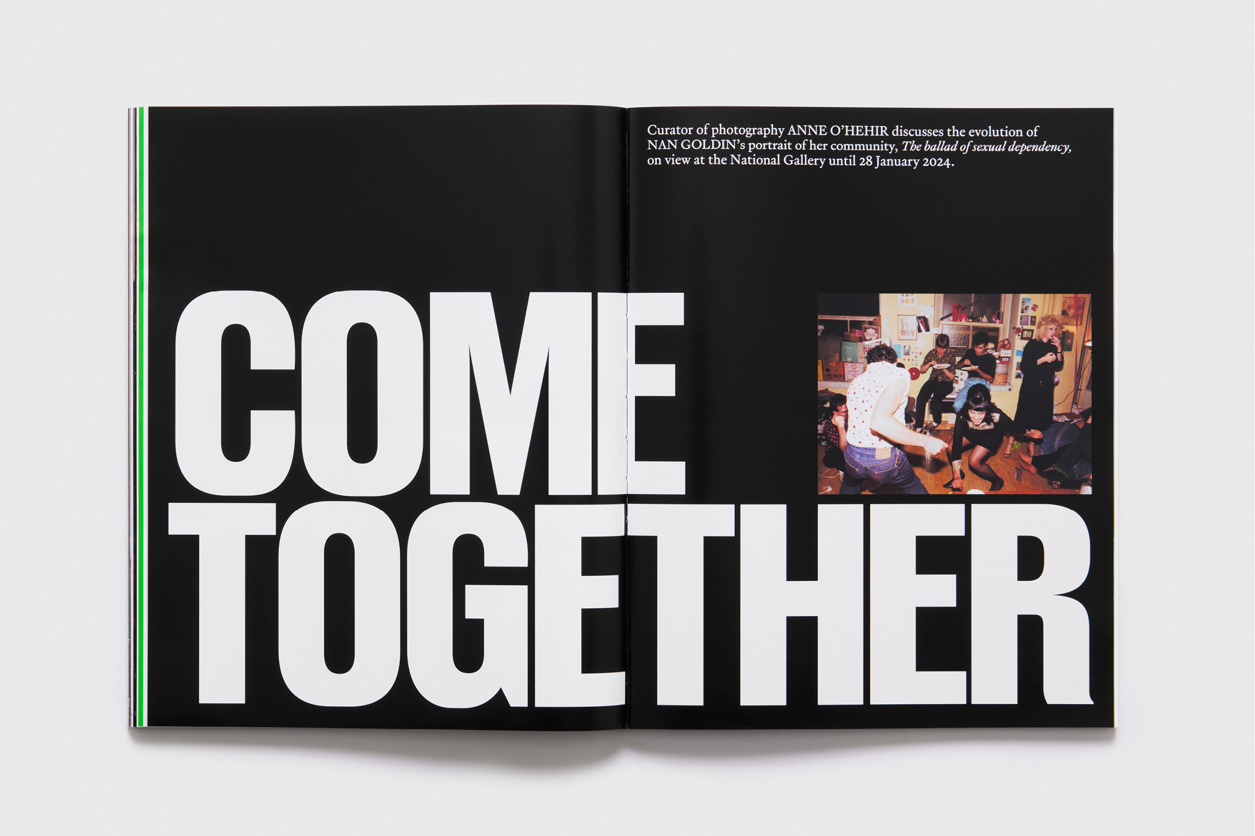
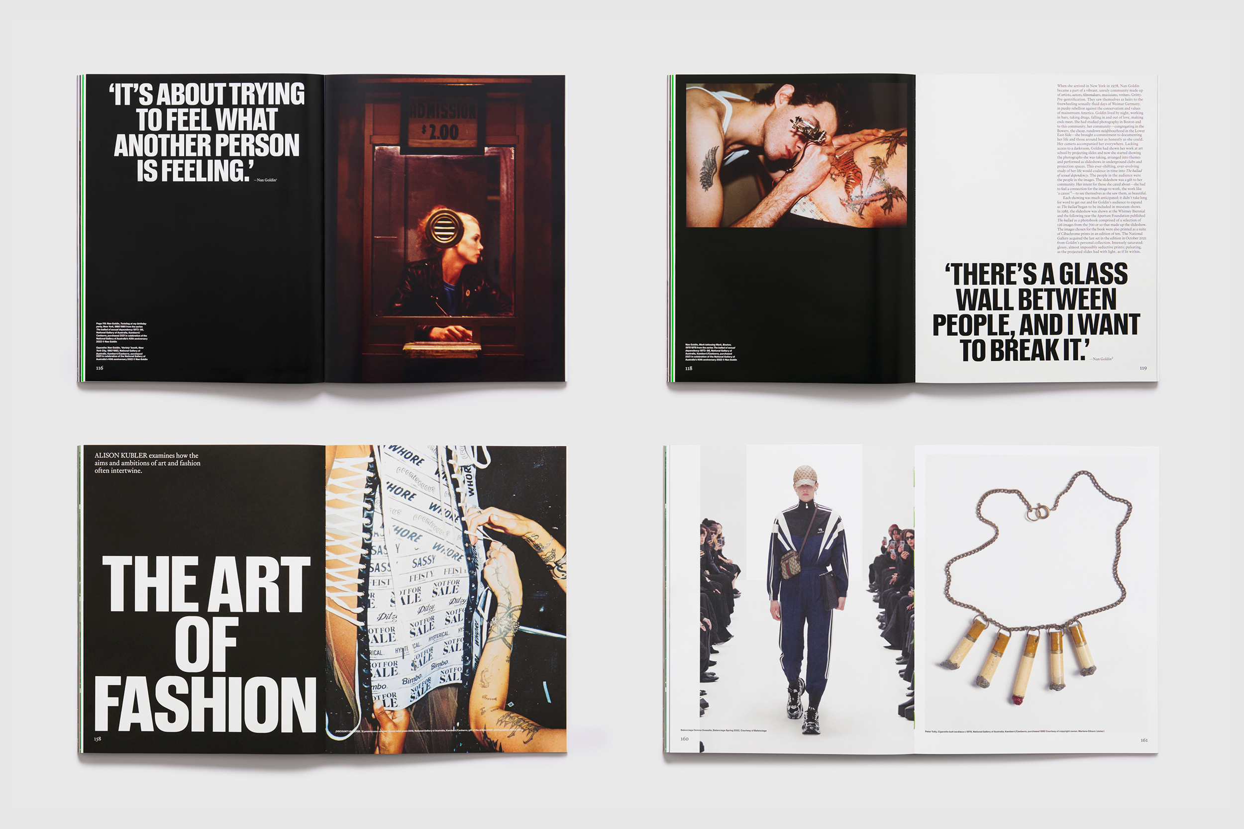
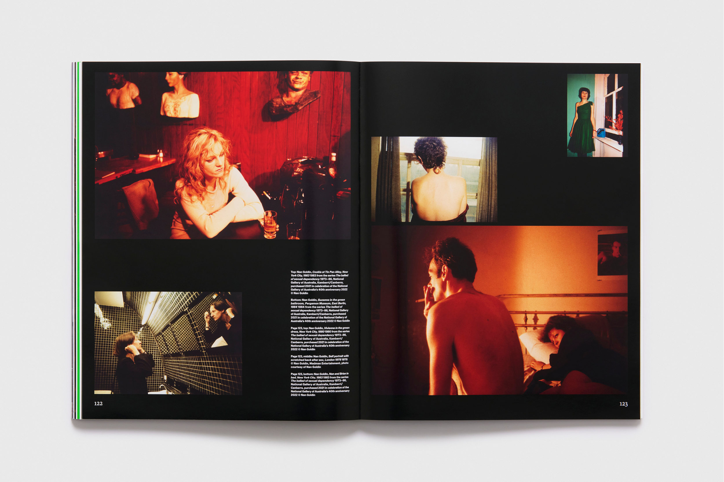
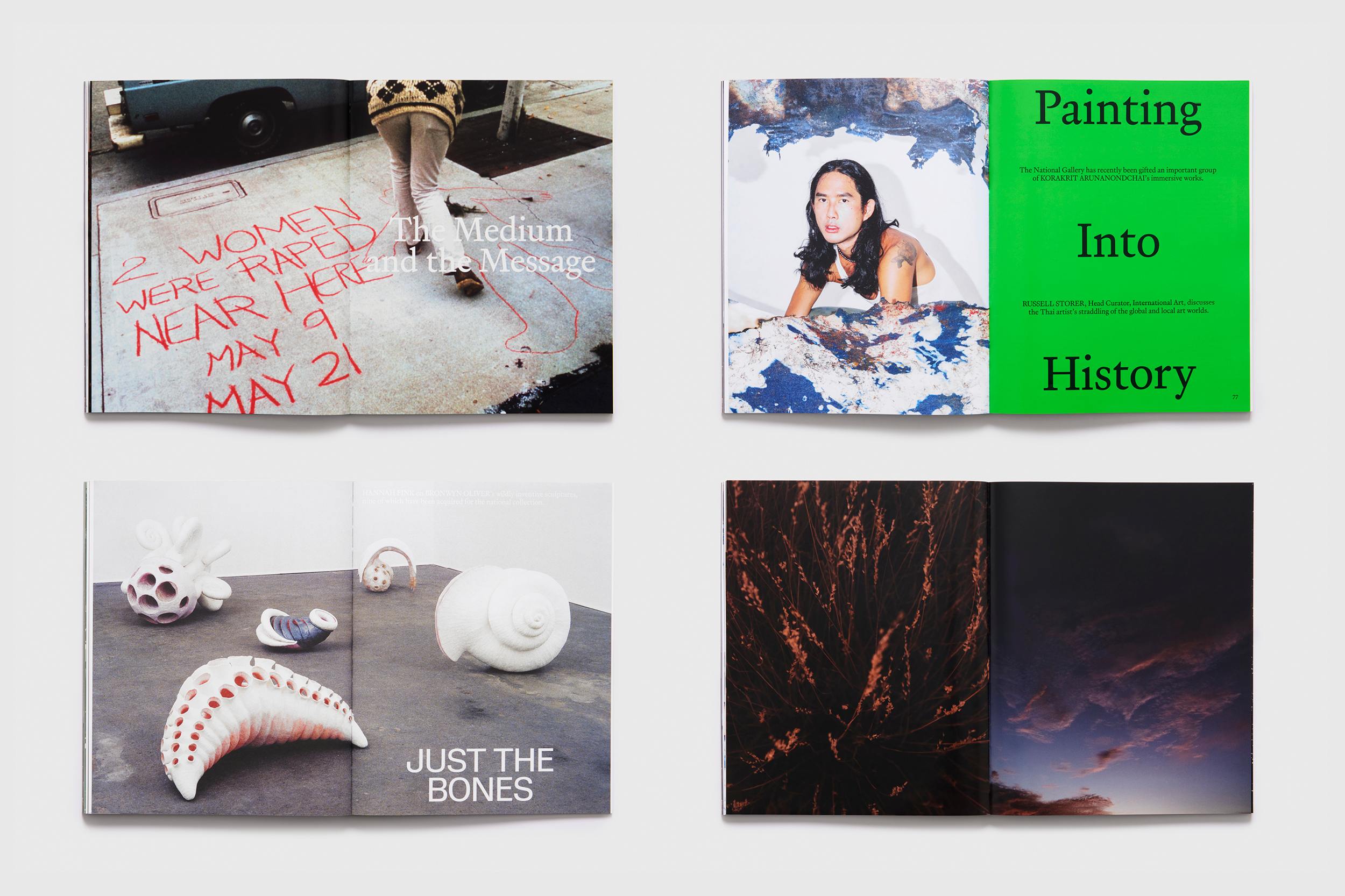
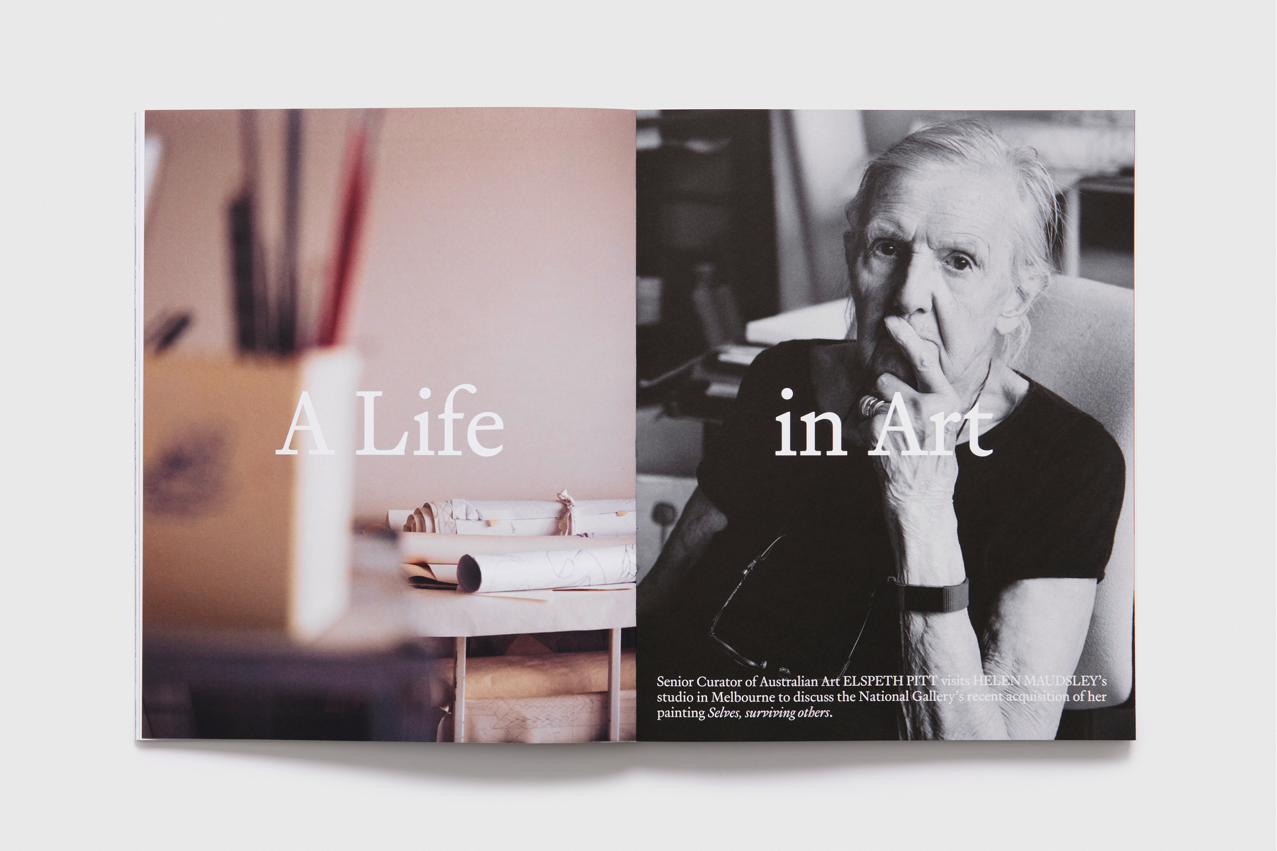
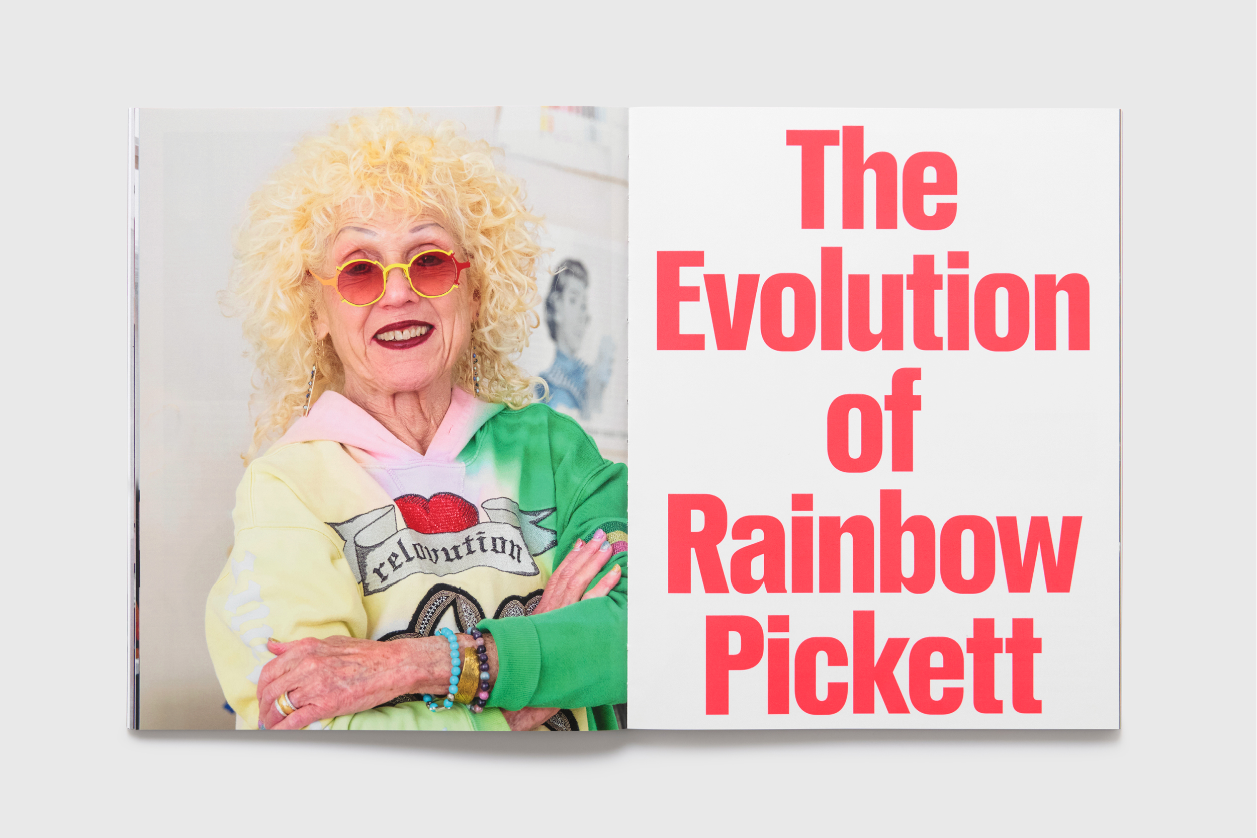
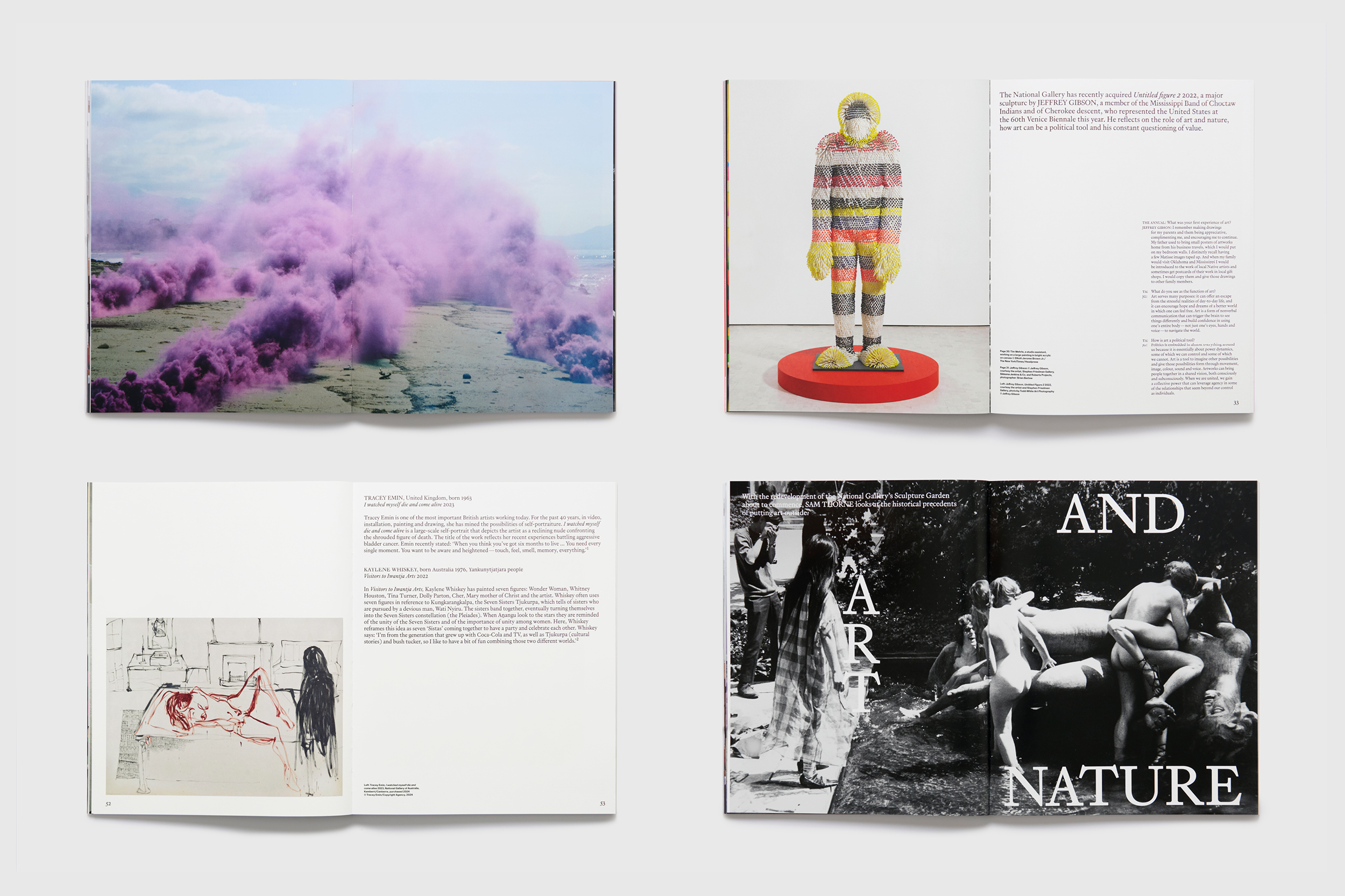
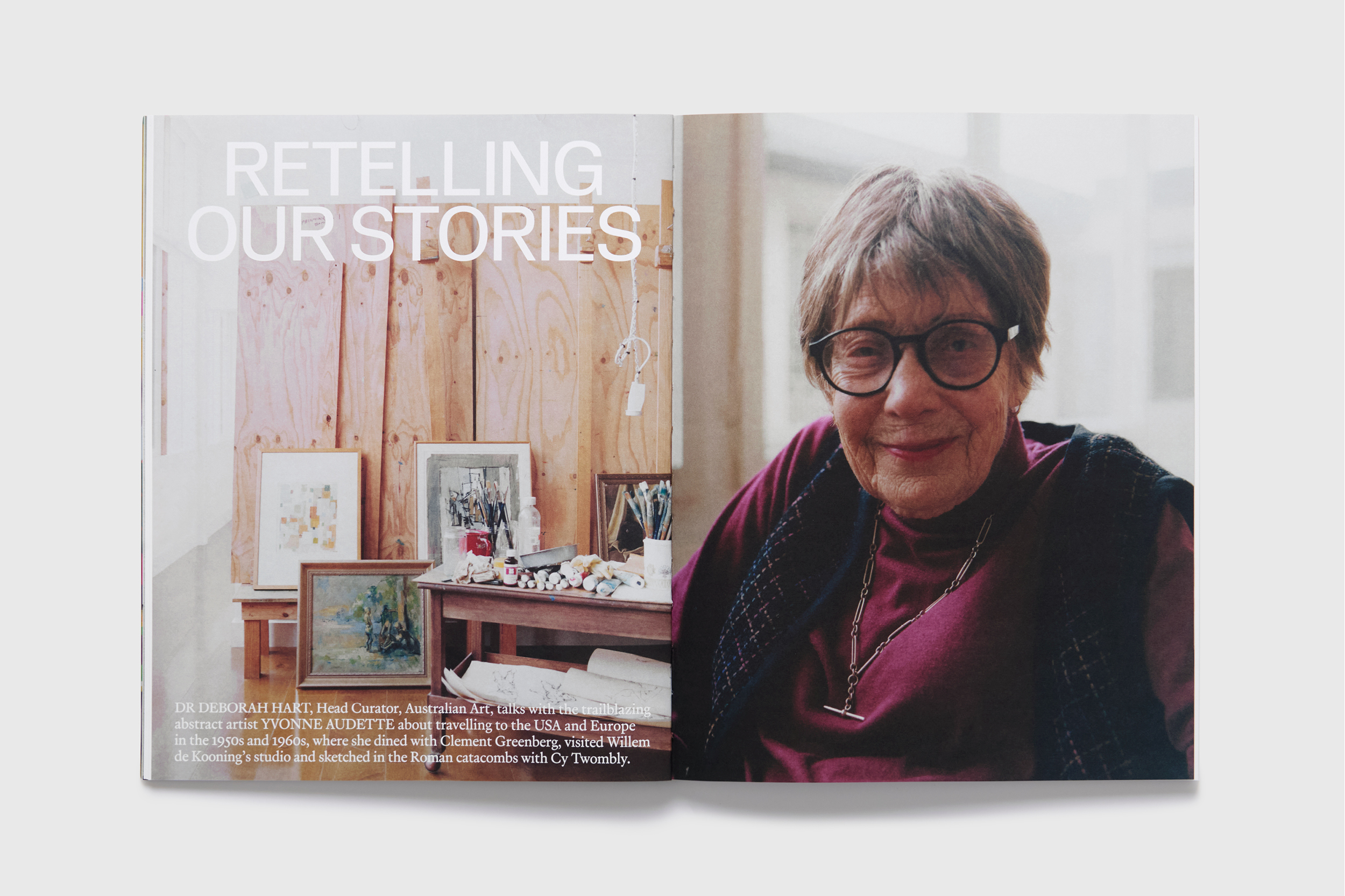
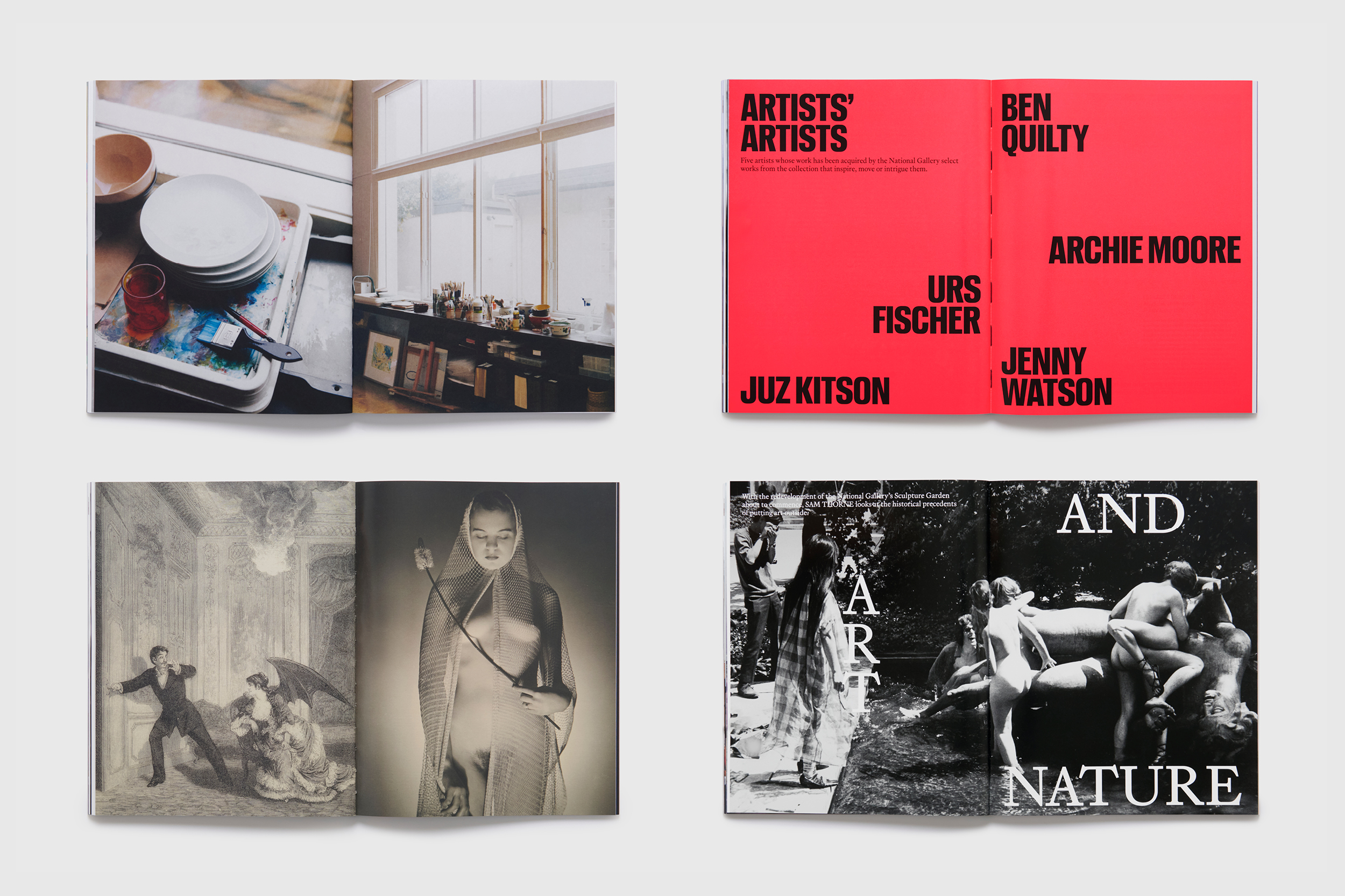
(EN) Published by the National Gallery and edited by Jennifer Higgie, The Annual challenges the traditional institution magazine in breadth, depth and form, with stories exploring art and ideas beyond the gallery walls.
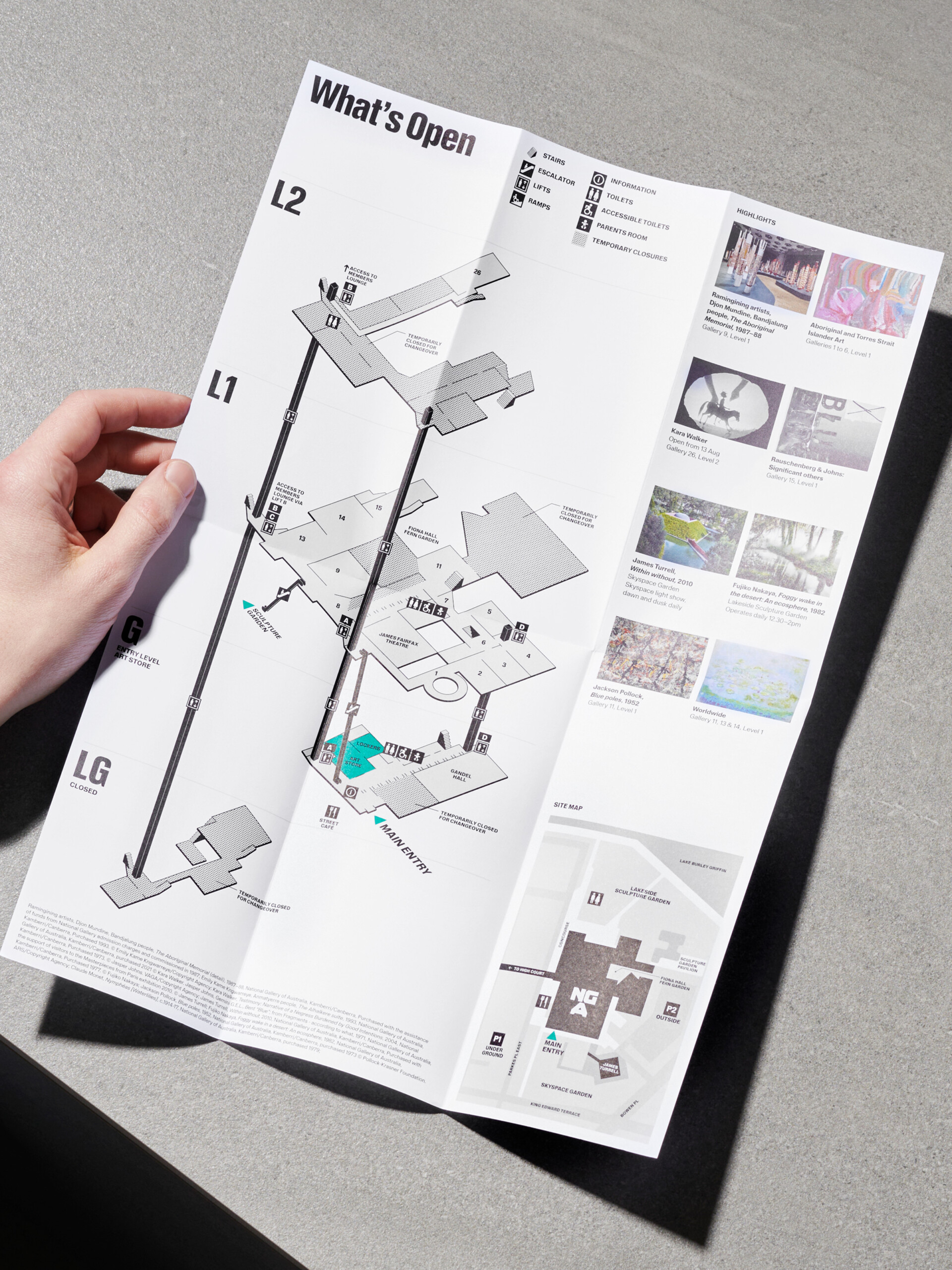
(EN) A digital program wall at the beginning of the visitor experience serves as an orientation hub, displaying both level information and spatial map, as well as promoting exhibitions and events.
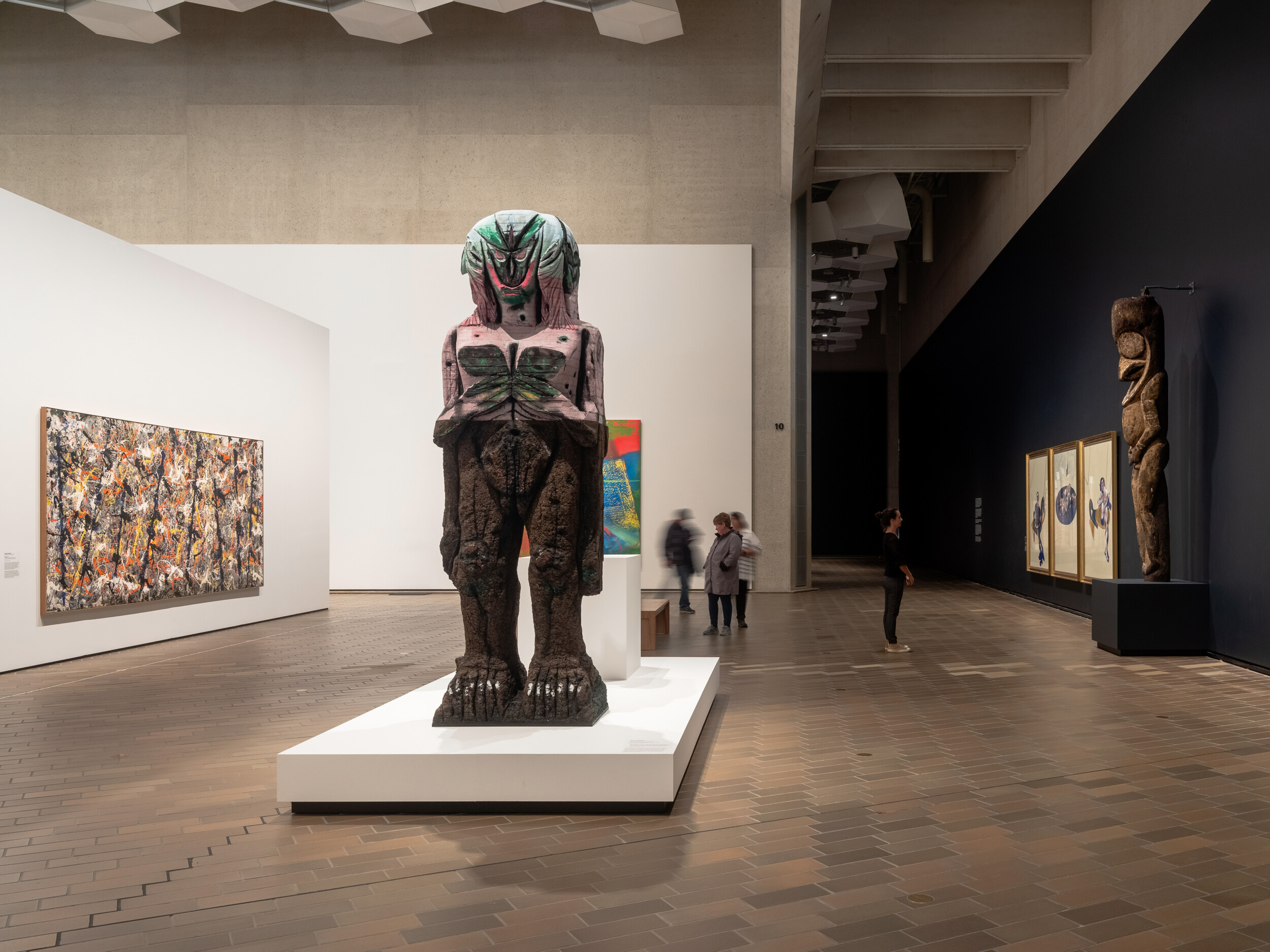
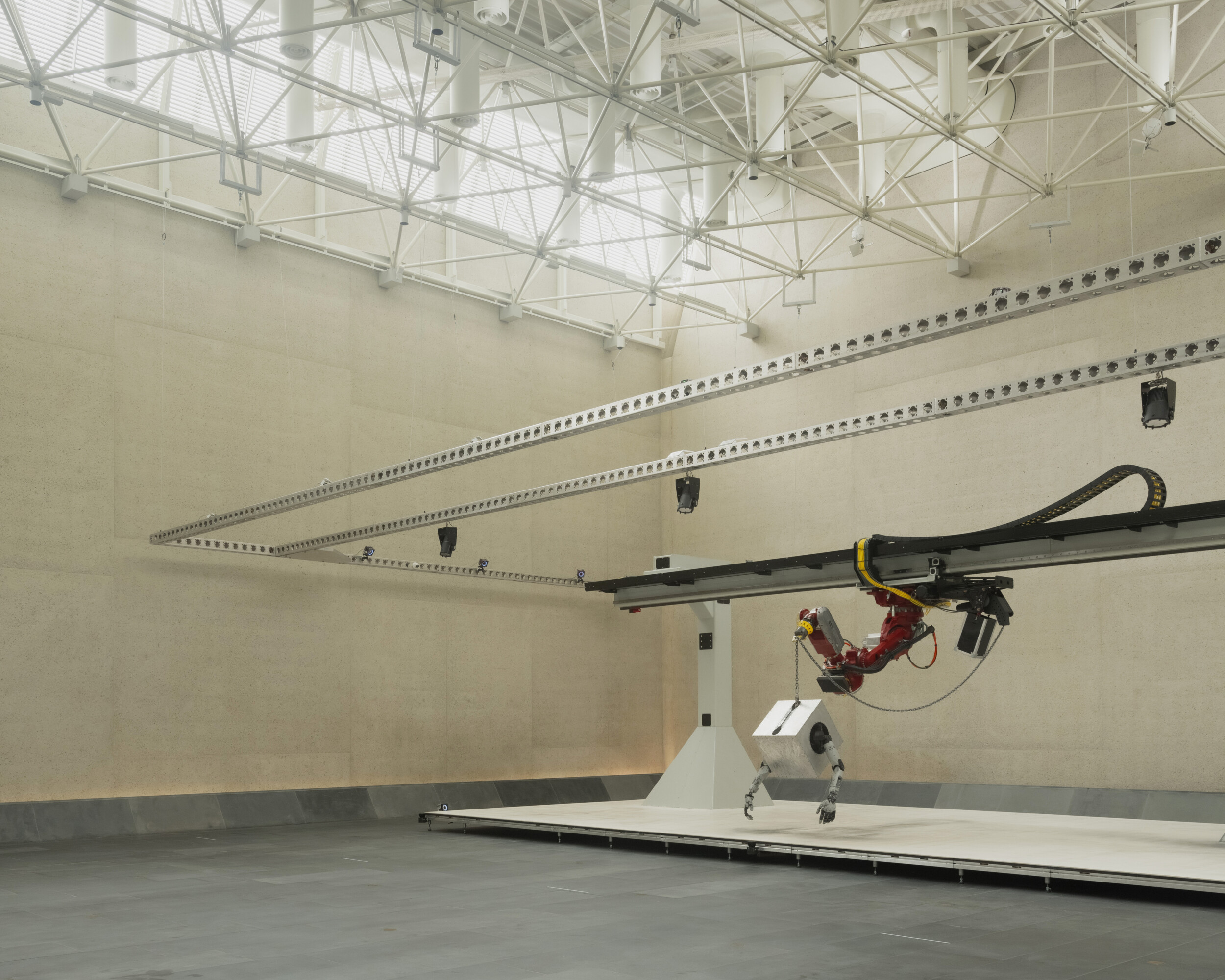
The National Gallery of Australia opened in 1982 and houses the national collection within an iconic Brutalist building designed by Col Madigan. Under new leadership, the gallery has sought to reaffirm its founding spirit of bold and visionary acquisitions, exemplified by the controversial purchase of Jackson Pollock’s Blue Poles. This legacy continues today through contemporary initiatives such as Jordan Wolfson’s Body Sculpture, the gender equity program Know My Name, and the nationwide collection project Art Across Australia.
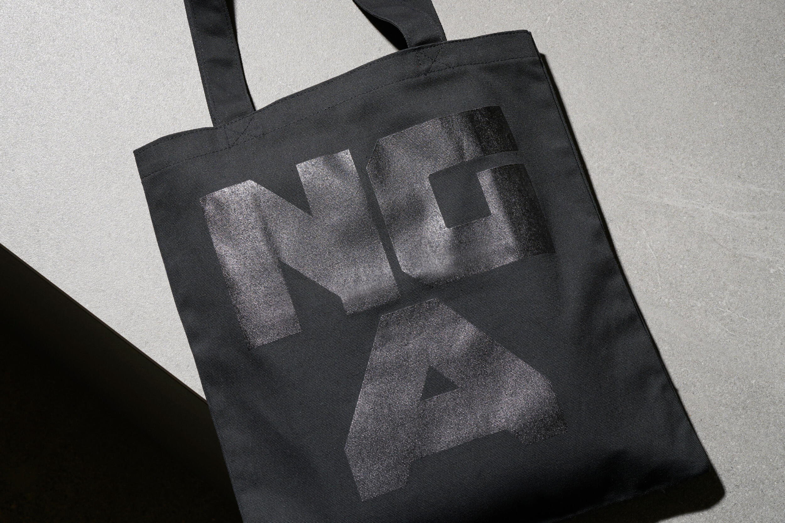
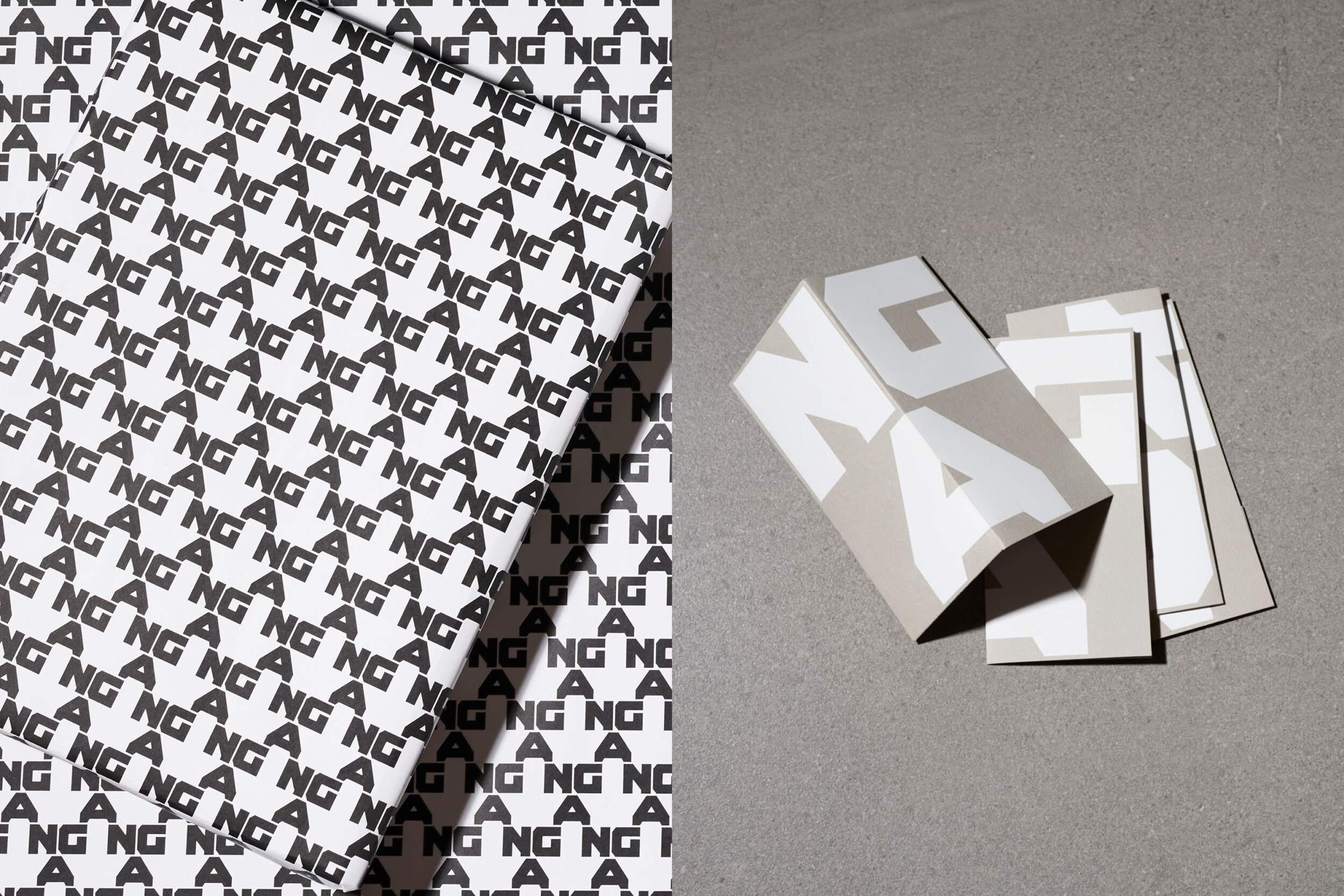
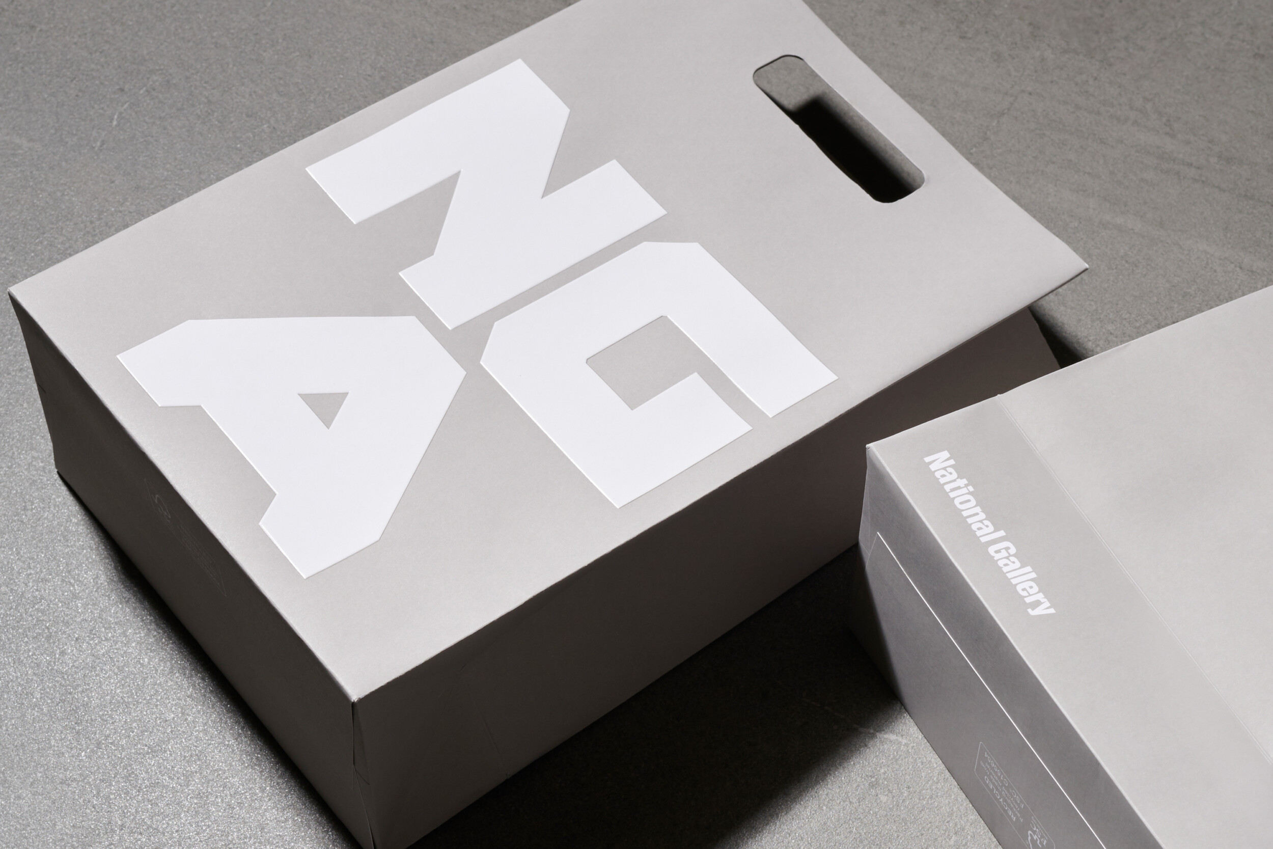
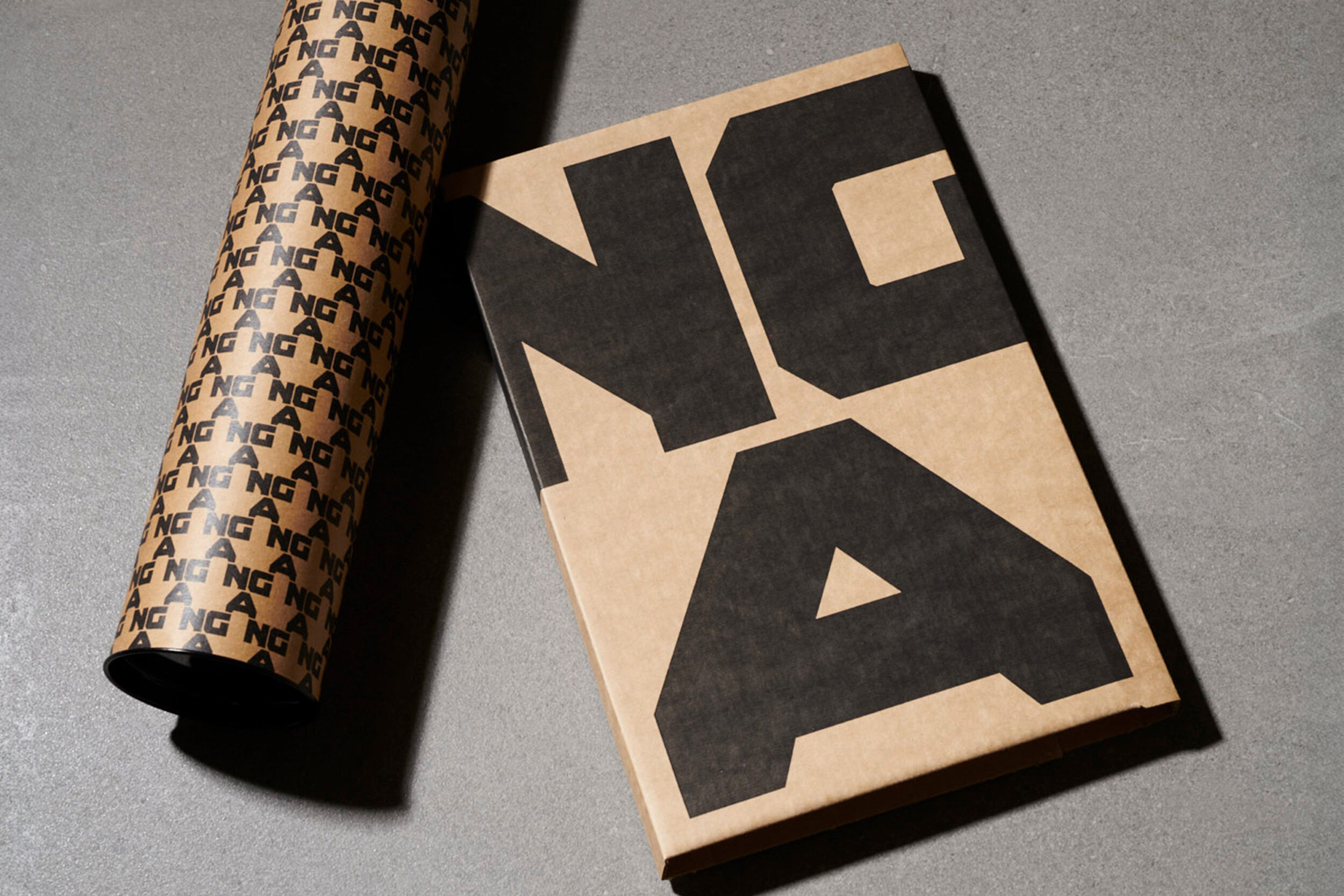
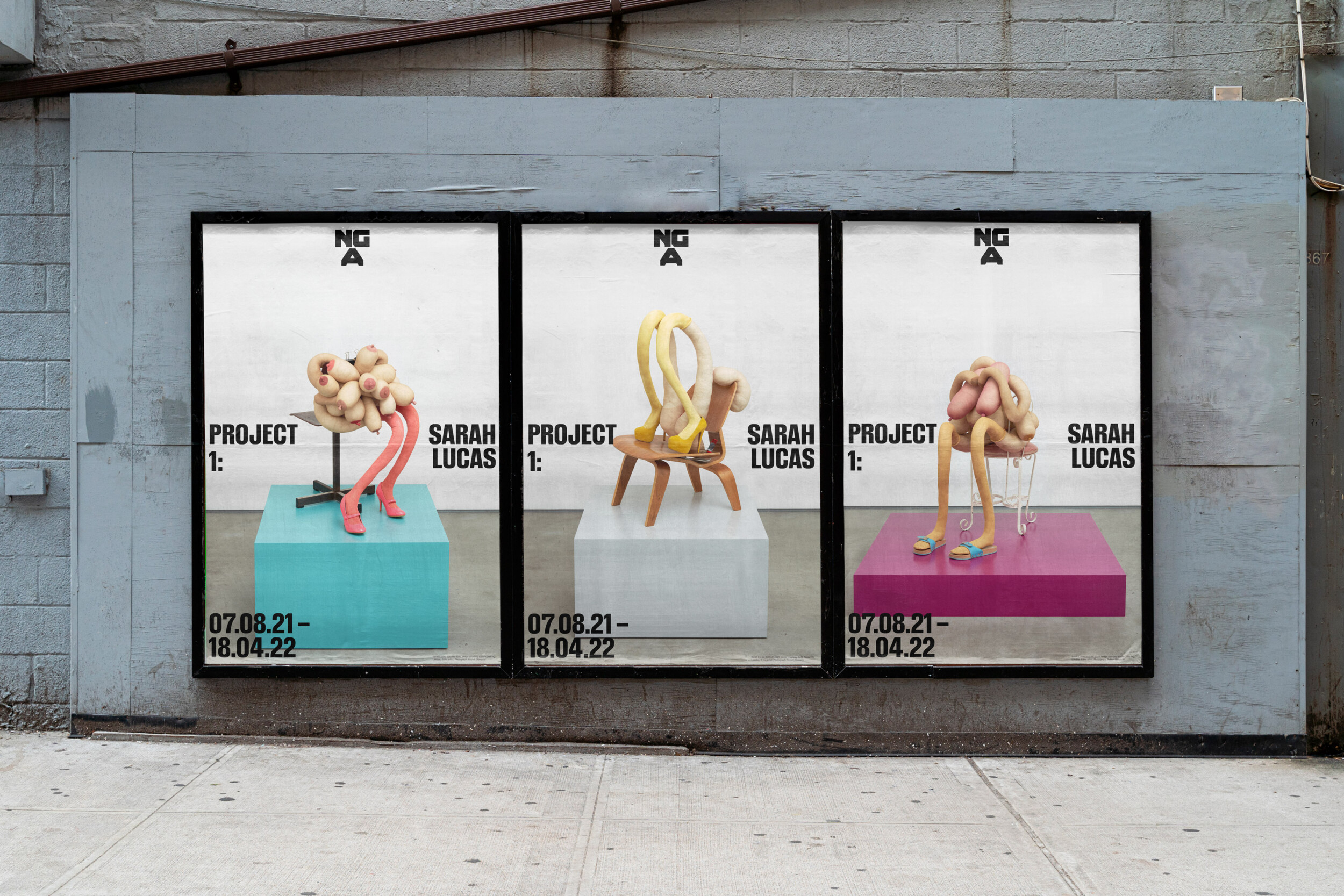
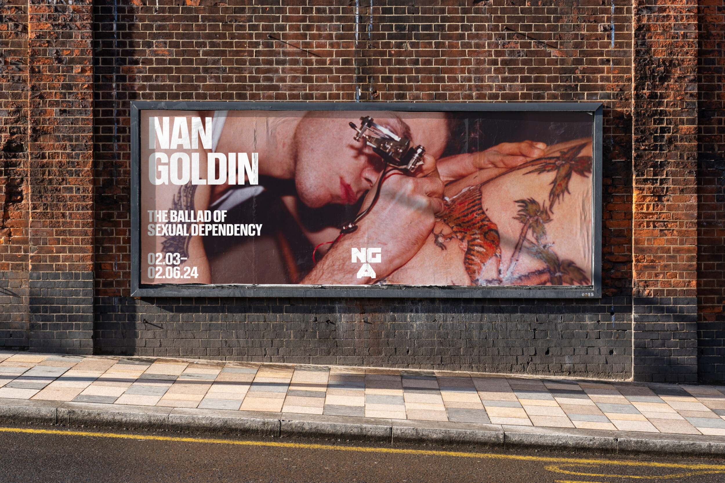
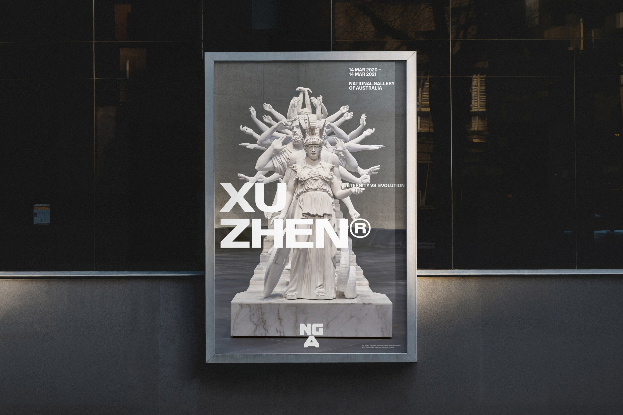
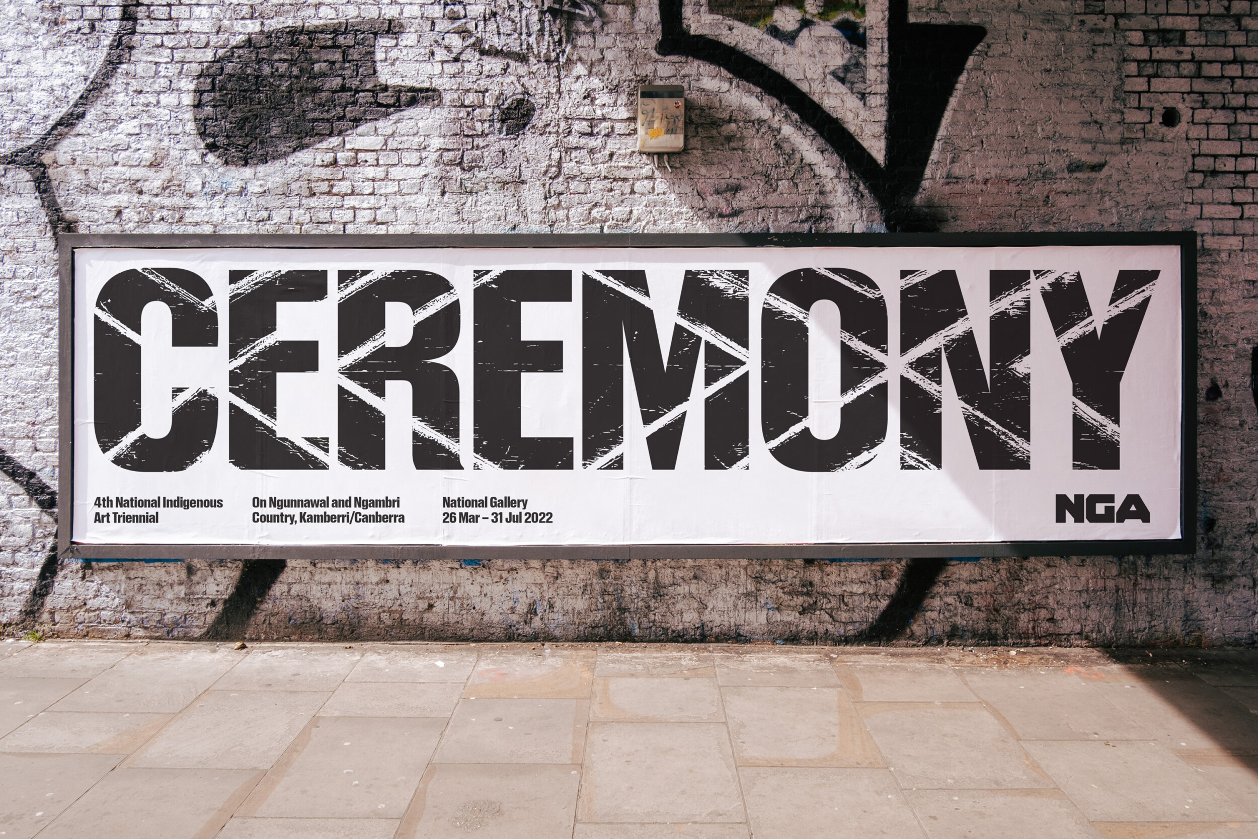
The brand captures the original and renewed spirit and ambition of the gallery and its brutalist architecture. At the heart is a new mark, where the intersection of the letterforms creates a central axis, reflective of the positioning as the centrepoint for art for the country, a convergence point as well as the triangular motif present in the physical identity. It is both symbol and language, adapting to scale with repetition, like the iconic gallery ceiling and as a platform for image.
A suite of typefaces was created to provide one confident voice with varied expression for specific contexts and individual campaign identities, uniting brand across many channels and applications, including publishing of the significant annual magazine. Storytelling supports gallery programming, enhancing the connection of artists and audiences to be truly national, accessible to all through on site, online and on tour experiences.
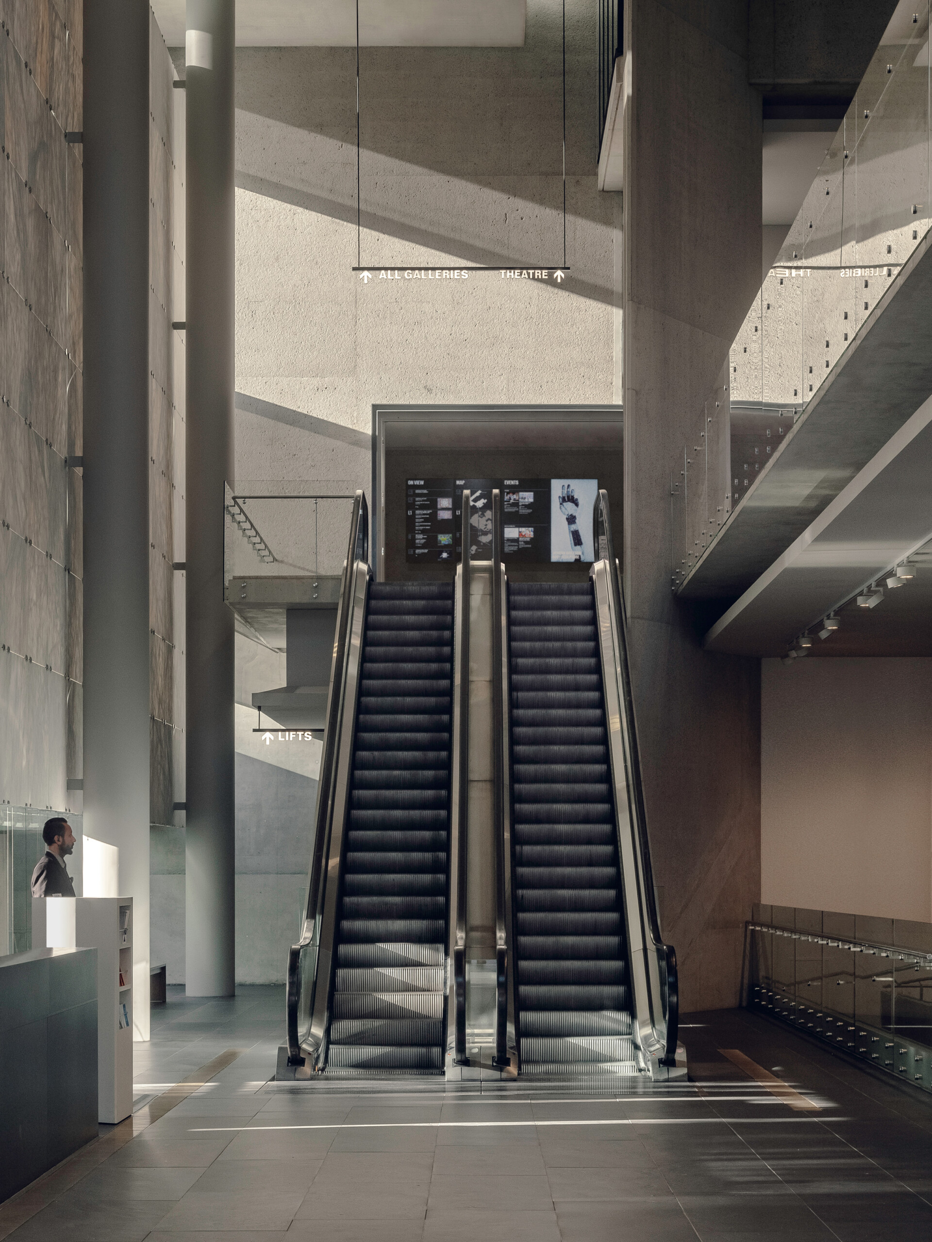
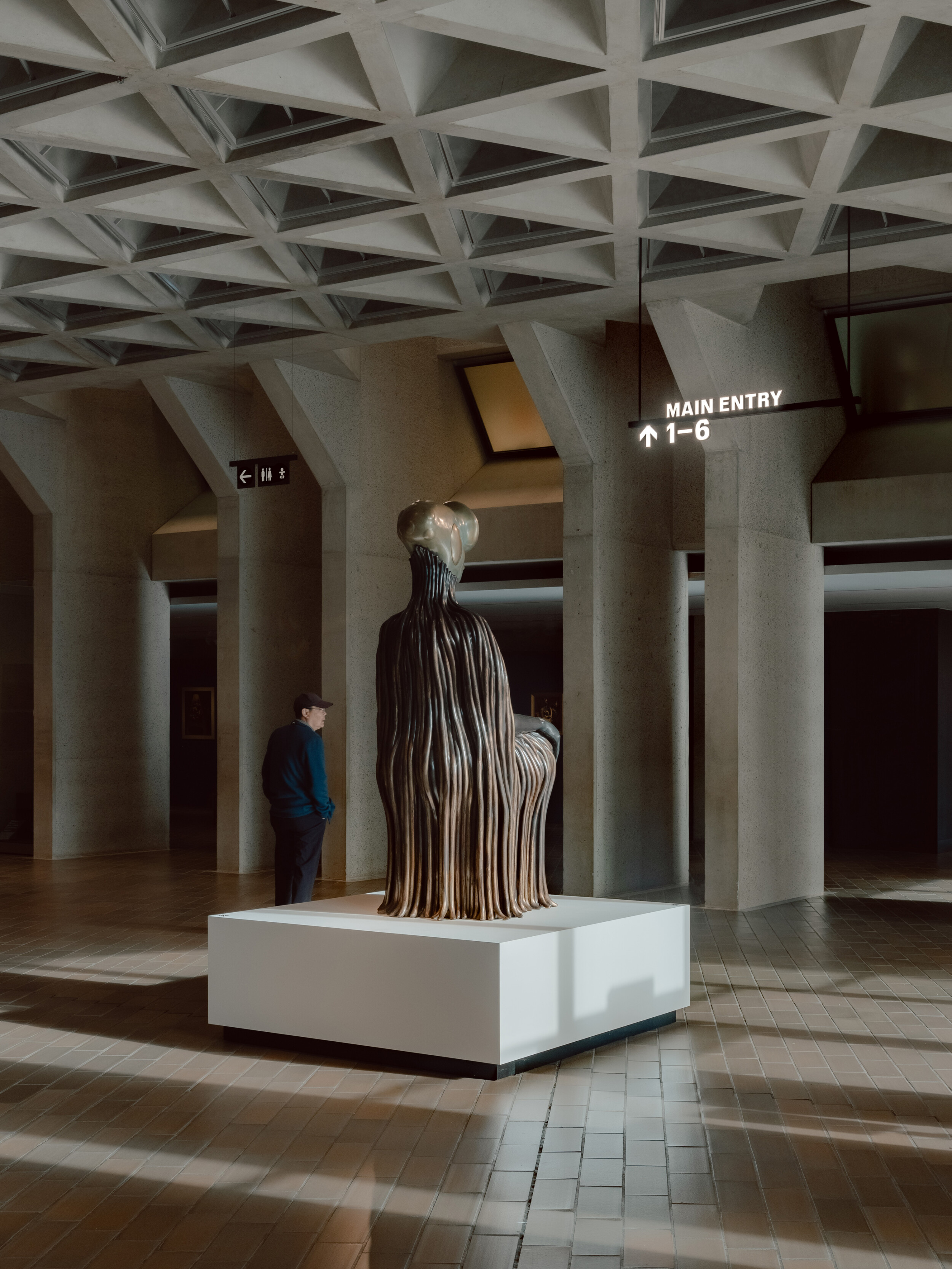
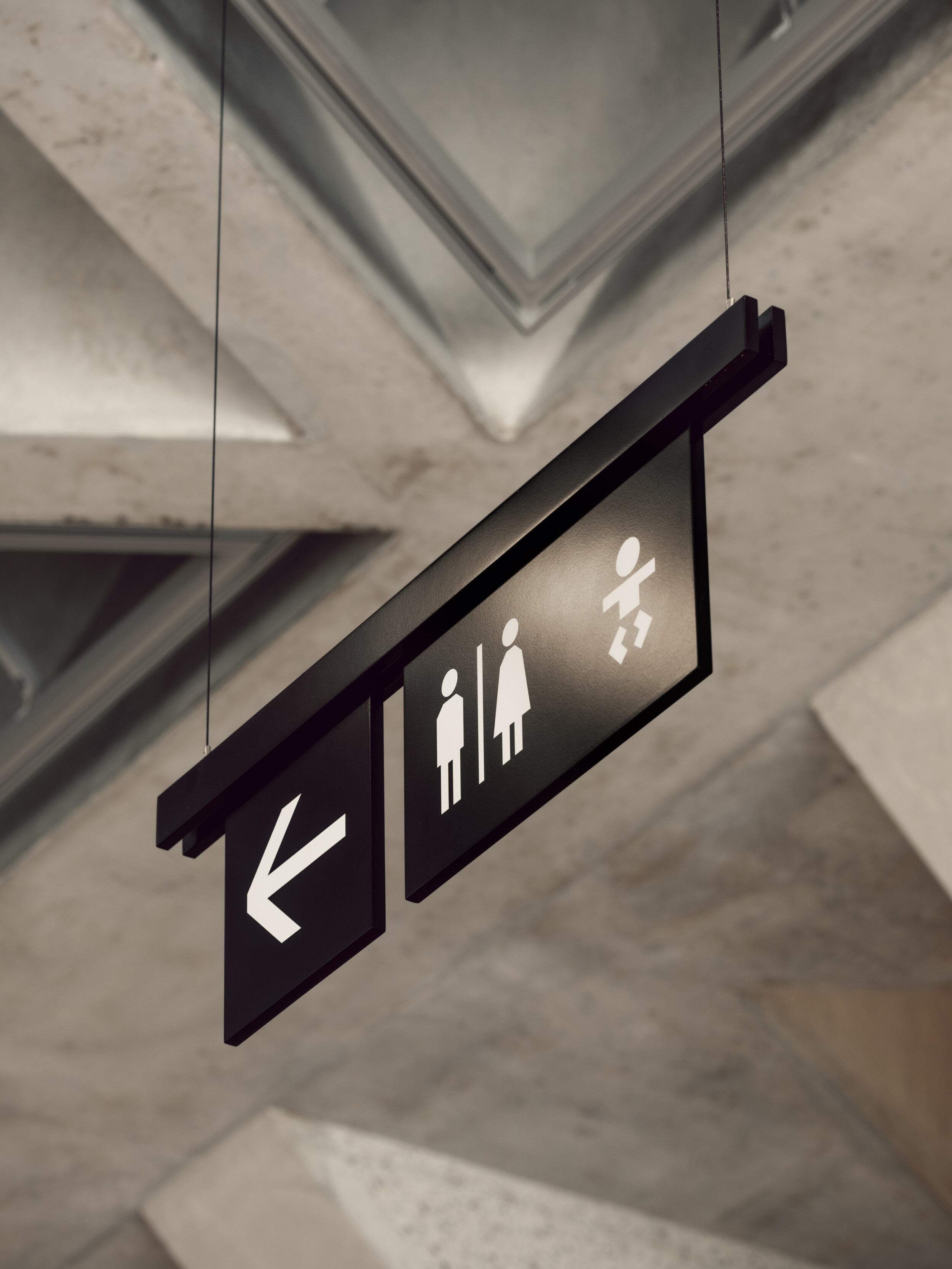
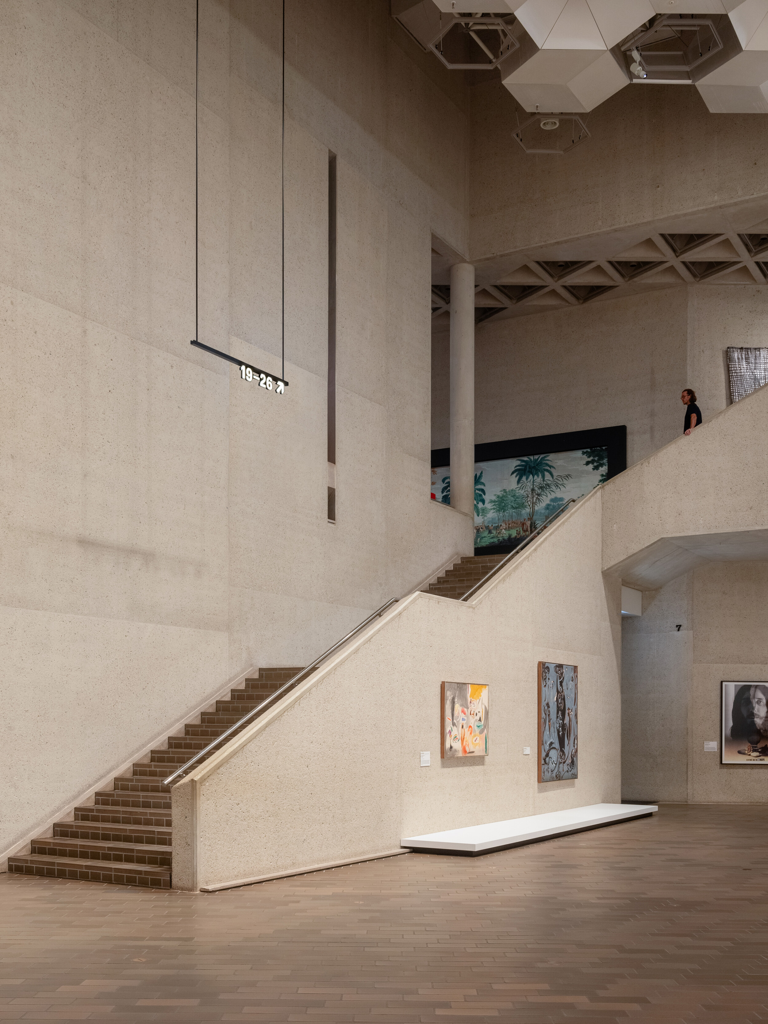
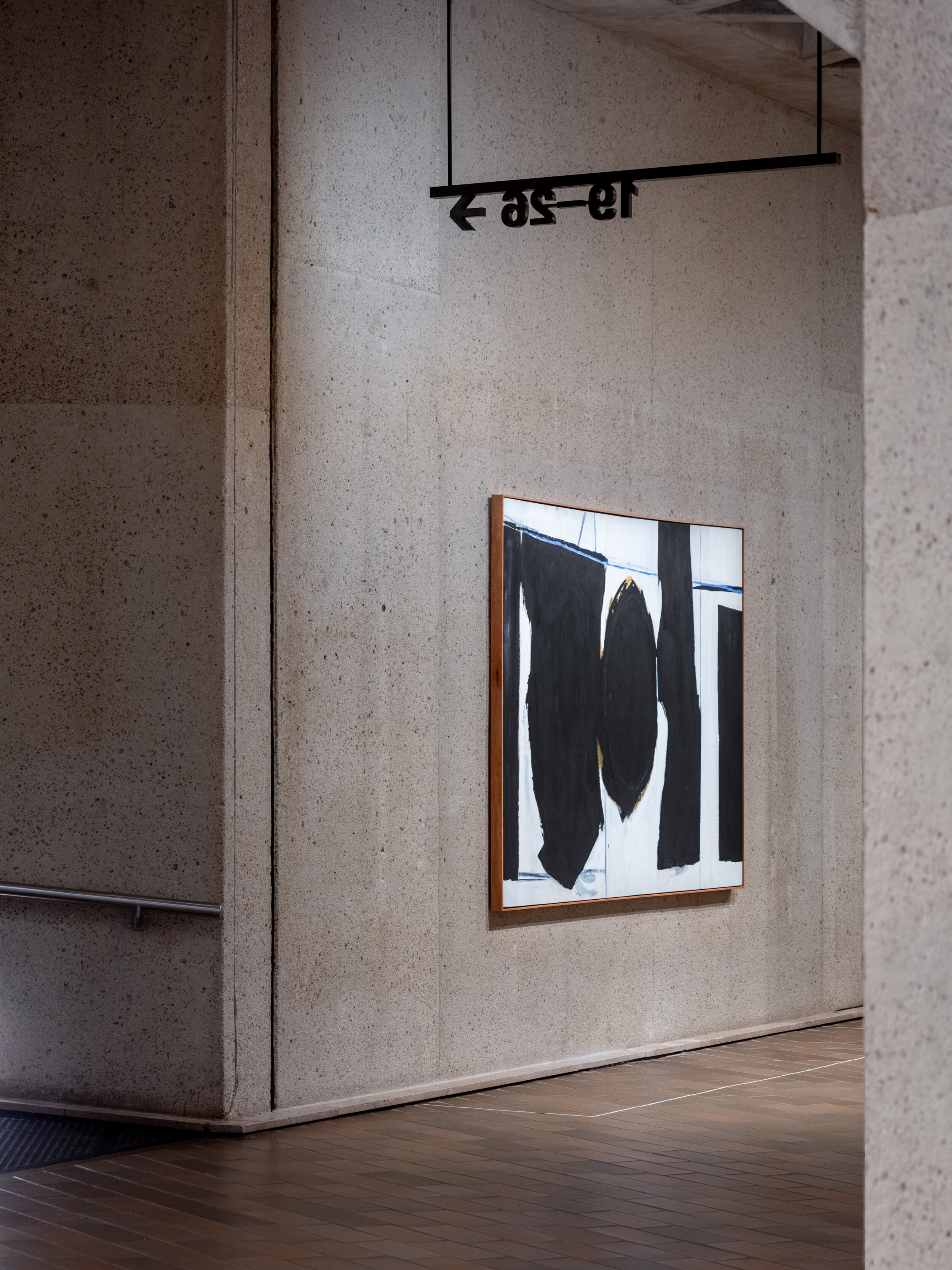
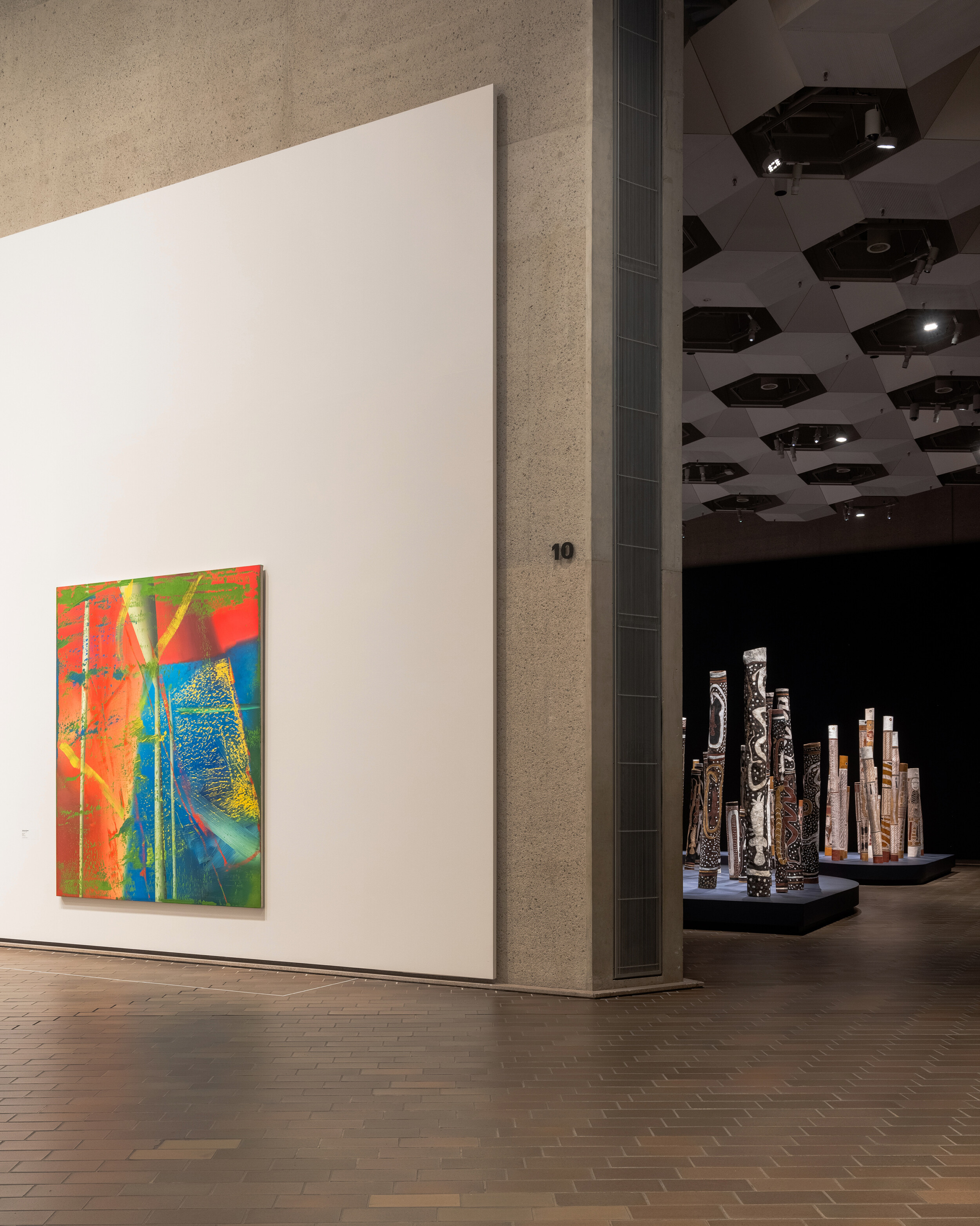
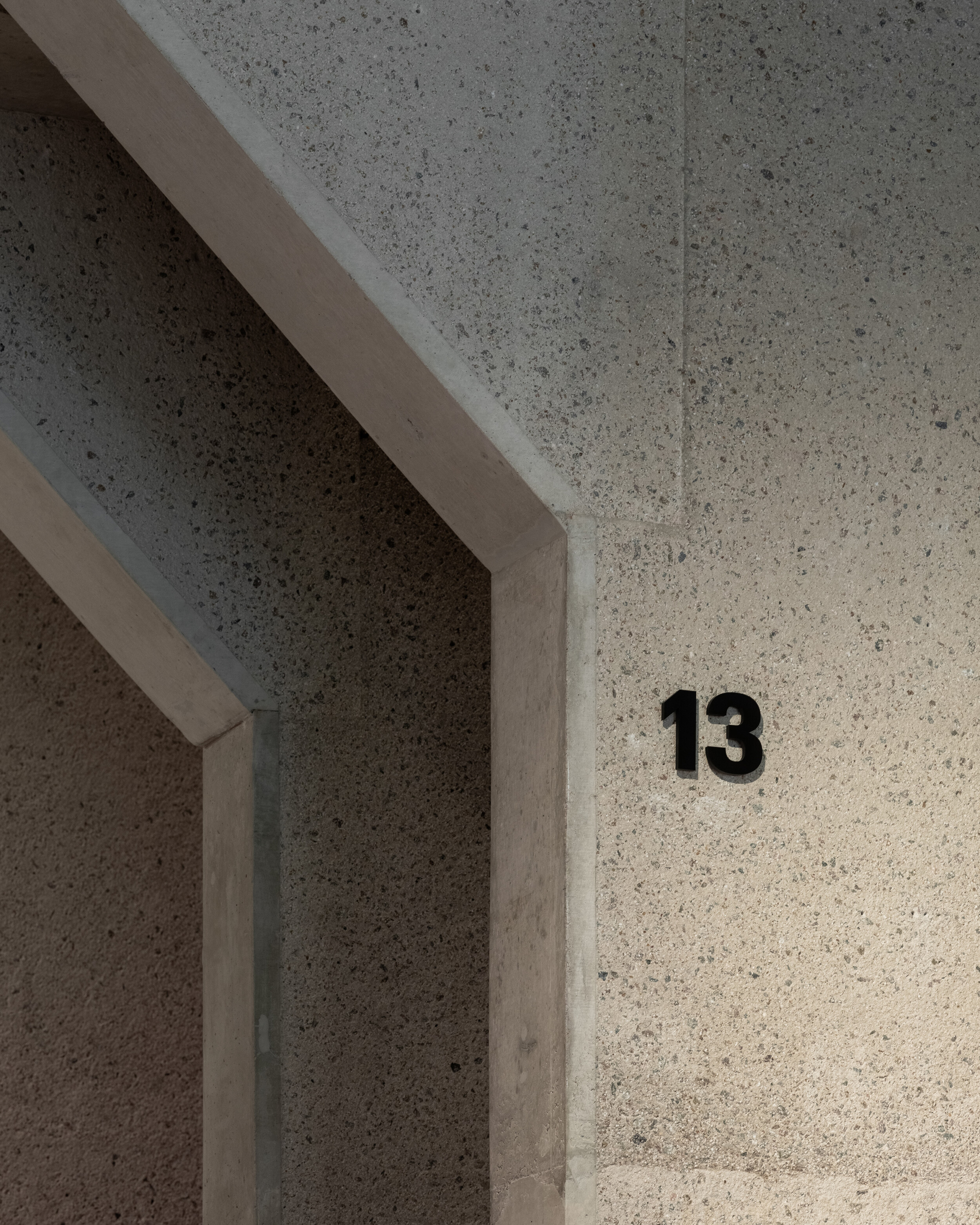
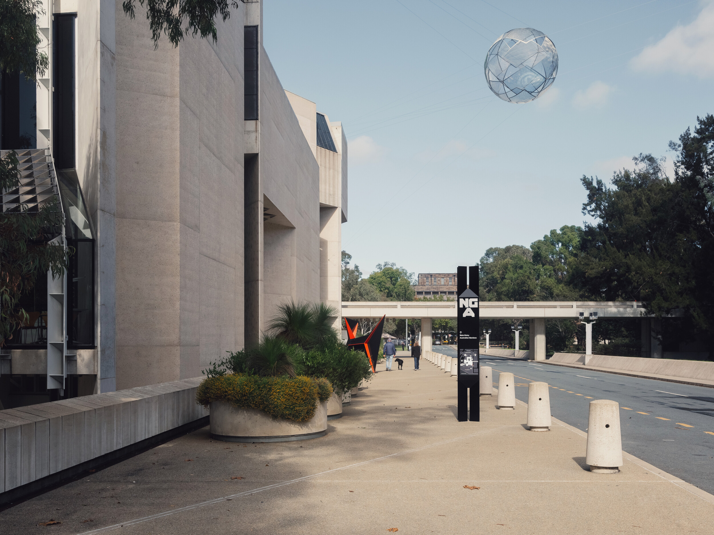
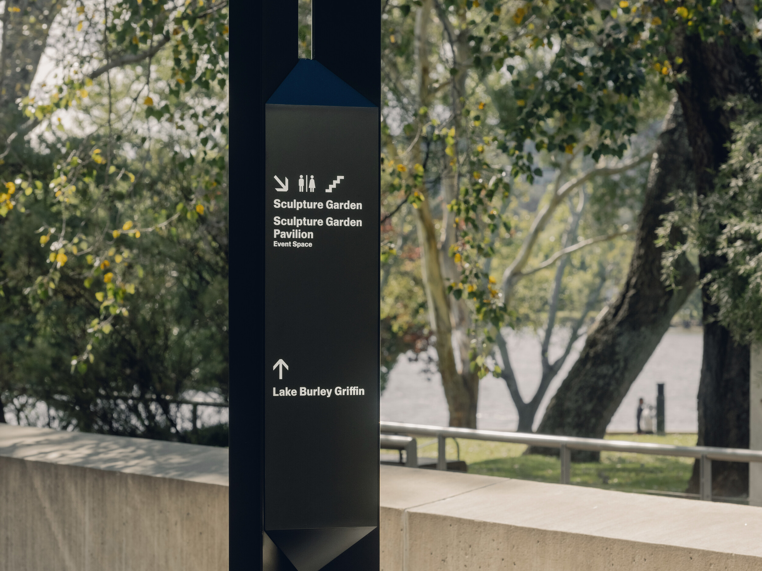
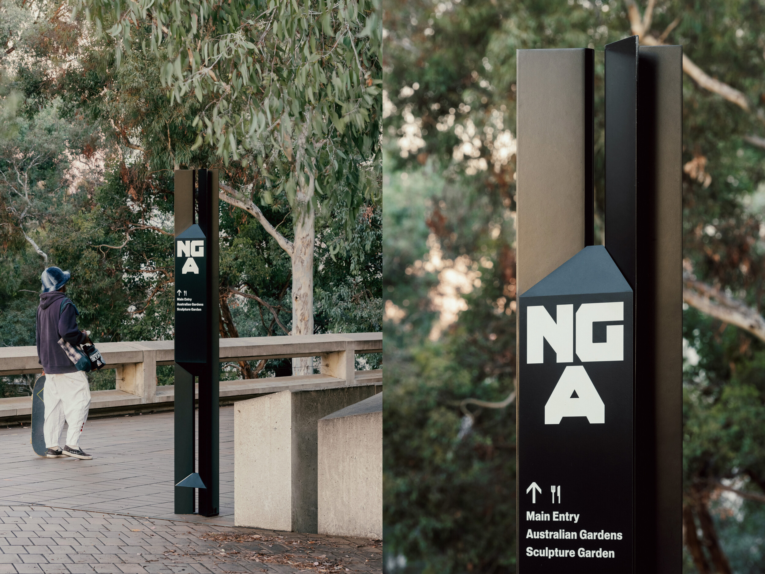
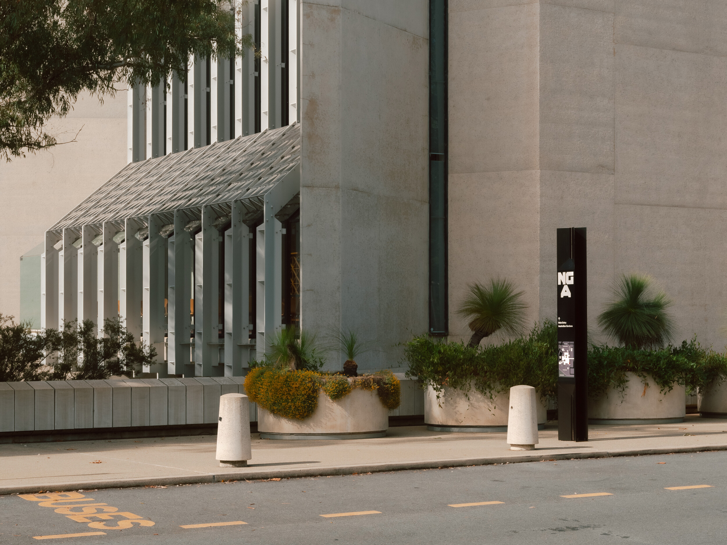
The task for the new wayfinding system was twofold: to enhance the visitor experience by making the gallery easier to navigate while encouraging exploration, and to introduce a design language that respects the past while supporting the future. The keystone of the wayfinding strategy is an intuitive gallery numbering system paired with an axonometric map. Directing visitors to numbers rather than exhibition names is clear and bold, a concept reinforced throughout the entire navigation system. Clusters of large digital screens serve as orientation hubs, promoting exhibitions and events, while the map enhances spatial awareness. The signage elements create a new overlay—a contemporary interpretation of an Australian institution.
The new brand has cemented the significance of the gallery for the nation and a new generation.
-
(EN) Project Scope
(EN) Brand Strategy
(EN) Content Strategy
(EN) Brand Identity
(EN) Campaign Identities
(EN) Art Direction
(EN) Typography
(EN) Packaging
(EN) Publication
(EN) Digital Design
(EN) Signage & Wayfinding
-
(EN) Photography
(EN) Dan Preston and Rory Gardiner
-
(EN) Awards
(EN) 2024 Tokyo TDC Annual Awards, Excellence, Brand & Identity
(EN) 2024 AGDA Awards, Merit, Signage & Wayfinding
(EN) 2023 AGDA Awards, Merit, Publications
(EN) 2023 AGDA Awards, Distinction, Brand & Identity
(EN) 2023 AGDA Awards, Merit, Logos & Trademarks
(EN) 2022 MAPDA Awards, Best Institution Website